So I've been trying to incorporate the transparent tiles with the new folder tiles on my Lumia 925. I'm not a huge fan of mixing transparent and non-transparent tiles as it can really get cluttered (just my opinion!). I'm going with three medium folders at the bottom, along with 6 black, settings-type icons at the very bottom. It creates in interesting slide-out drawer feel:
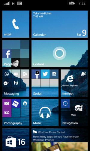
i noticed that most people sort their tiles by priority. meaning the most used tiles like "phone" and "Calendar" on the top and rest further down.
i prefer those tiles at the very bottom of the visible part of the screen. because screens are getting larger and i find it more conveniant to have them in reach. like apple and android do with their "docks".
i will post my screen next week when i get my new 930.


")


 Twitter