Post your Home Screen and Color Theme
- Thread starter vizagdude
- Start date
You are using an out of date browser. It may not display this or other websites correctly.
You should upgrade or use an alternative browser.
You should upgrade or use an alternative browser.
Matt Schwartz
New member
- Sep 14, 2013
- 4
- 0
- 0
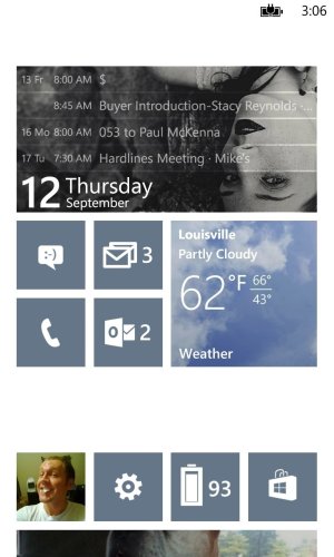
The simplicity of the Windows Phone UI continues to intrigue me. I've spent months customizing the Start Screen design into this.

I am one of the few who own a Samsung ATIV Odyssey. It does what I need it to but otherwise a locked contract until a year February is going to be painstaking. The functionality and app-optimization on our platform is still a long ways from where it would have to be to draw a larger crowd of users; and to satisfy me in particular. While the marketplace IS growing exponentially, developers are not incorporating the features of live tile, lock screen, and detailed status.
I'm curious what the upcoming versions will implement and or change. Let's hope for some things exciting!
jiayit
New member
- Nov 19, 2012
- 302
- 0
- 0
Mind sharing where ddid you get the text headers? Probably mentioned a thousand times in this thread but I'm lazy to scroll through themThe simplicity of the Windows Phone UI continues to intrigue me. I've spent months customizing the Start Screen design into this.
Also, a rather random question but would you get another Windows Phone once your contract ends?
Matt Schwartz
New member
- Sep 14, 2013
- 4
- 0
- 0
No problem at all! HeaderTiles | Windows Phone Apps+Games Store (United States)
The next product I will invest in, I am unsure.
From a design perspective I would argue that each the Windows Phone, Android, and IOS, are on par with each other. I suppose that I partially chose the Windows Phone when switching over to Verizon from AT&T (where previously I owned a different Samsung product - not a smartphone though) because of the Microsoft Office utility and the simplicity I mentioned with the design. The suite of productivity applications pre-built into the phone I have noticed to be sub-par - editing documents is a hassle! - and the design can only go so far if developers persist on not implementing the variety of functions available to them. Still, the UI is clean and convenient.
If I could purchase a phone right now I would look into a Google buy (the widgets component seems brilliant), that is unless Microsoft does improve the system capabilities.
jenni122701
New member
- Aug 6, 2013
- 181
- 0
- 0
I love the white background, do you guys using it notice a larger drain in battery than with the dark themes? Ive stuck with the dark because I read somewhere that it was easier on battery.
Sent from my iPad 3rd Gen using Tapatalk
Sent from my iPad 3rd Gen using Tapatalk
Not alot, but noticeably quickerI love the white background, do you guys using it notice a larger drain in battery than with the dark themes? Ive stuck with the dark because I read somewhere that it was easier on battery.
Sent from my iPad 3rd Gen using Tapatalk
Boris Lozac
New member
- Aug 10, 2013
- 508
- 0
- 0
For the 10th time  It doesn't have any effect on the battery if you have an LCD screen, only on AMOLED's it uses more battery.
jenni122701
New member
- Aug 6, 2013
- 181
- 0
- 0
Ok, ty for the reply, went ahead and switched to white bg for a while then.


Sent from my iPad 3rd Gen using Tapatalk


Sent from my iPad 3rd Gen using Tapatalk
Marconis4
New member
- Mar 16, 2013
- 355
- 0
- 0
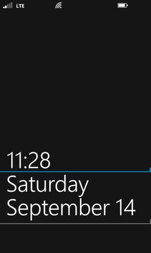
Hi guys, back again. This time, I changed around my lockscreen a bit, with only a slight modification to the start screen. I wanted to do a white background to match the light theme that I have, but of course, as you know, we can't get black fonts on the lockscreen! I got this lockscreen idea from deuxani (thanks!). The phone is a Lumia 928, white, with a cyan Incipio feather case. Anyway, here it is:


Lumia720Jomz
New member
- Aug 10, 2013
- 64
- 0
- 0
david90531
New member
- Aug 29, 2011
- 1,081
- 0
- 0
I love the white background, do you guys using it notice a larger drain in battery than with the dark themes? Ive stuck with the dark because I read somewhere that it was easier on battery.
Sent from my iPad 3rd Gen using Tapatalk
If you use 920 it shouldn't, the type of screen doesn't require more battery with the white theme.
travis_valkyrie
New member
- Jan 3, 2012
- 449
- 0
- 0
Pieter Wolff
New member
- Aug 9, 2013
- 208
- 0
- 0
Ow yes it does, just less compared to amoledIf you use 920 it shouldn't, the type of screen doesn't require more battery with the white theme.
http://i39.tinypic.com/116i7hh.jpg
http://i44.tinypic.com/2qnpkch.jpg
I think this is my favorite so far.
Any one know how to do this without splitting image on two?
Davulsukur
New member
- Jun 10, 2013
- 84
- 0
- 0
If you mean create a gap between the windows logo and the other tiles, you could great some "blank" white tiles as a separator.
Boris Lozac
New member
- Aug 10, 2013
- 508
- 0
- 0
Similar threads
- Replies
- 14
- Views
- 13K
- Replies
- 14
- Views
- 7K
- Replies
- 2
- Views
- 2K
- Replies
- 5
- Views
- 8K
Trending Posts
-
-
Question Windows 11 and Linux on separate drives?
- Started by Verax
- Replies: 0
-
-
Question Win-11 - Problem with moving files from C: to New Partition on E:
- Started by fasteddie01
- Replies: 1
-
Windows 10 Themes no longer working...
- Started by DocCovington
- Replies: 6
Forum statistics

Space.com is part of Future plc, an international media group and leading digital publisher. Visit our corporate site.
© Future Publishing Limited Quay House, The Ambury, Bath BA1 1UA. All rights reserved. England and Wales company registration number 2008885.


