Ashish Anand1
New member
- Nov 13, 2013
- 10
- 0
- 0
Re: WP 8.1 Start Screen Backgrounds Thread (Official)
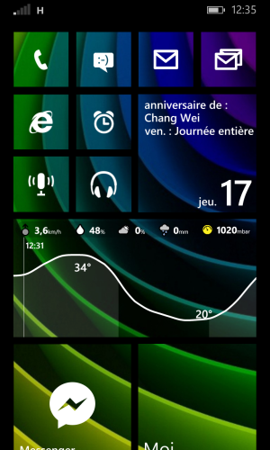
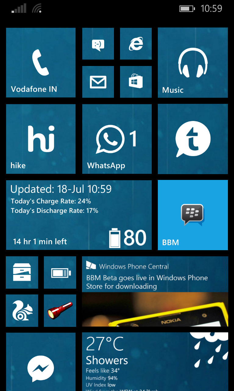
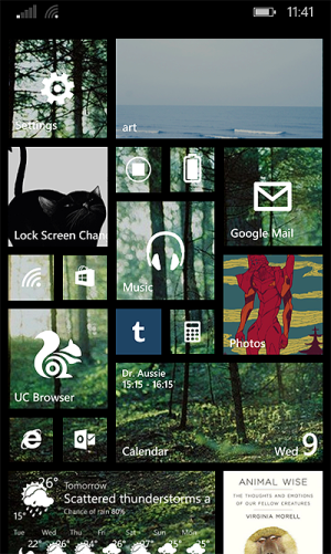
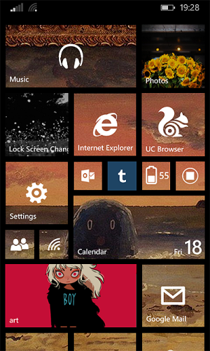
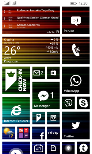
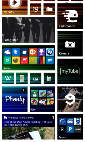
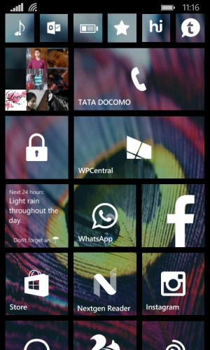
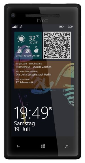
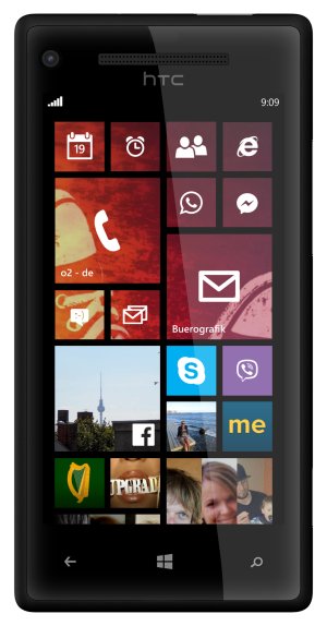
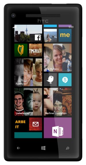
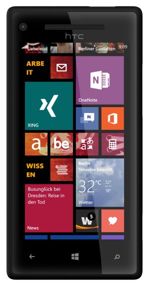
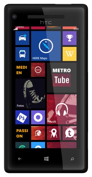
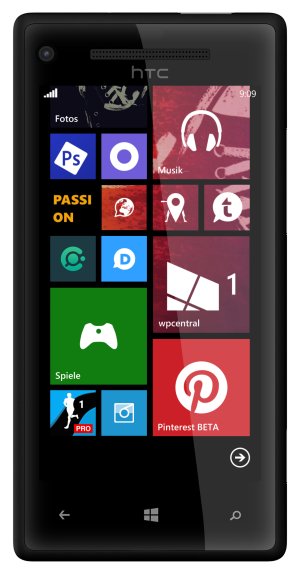
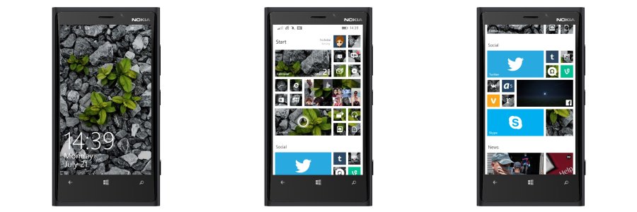
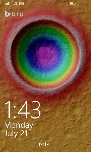
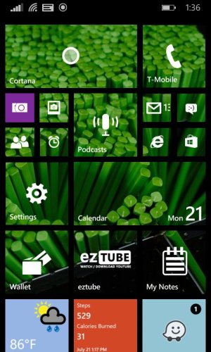
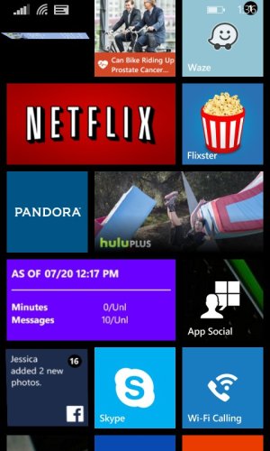
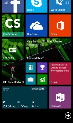
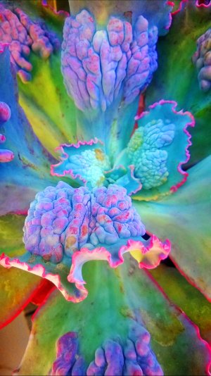
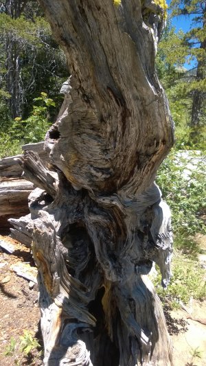
can u pls share all of them ??i have to admit i was really skeptical about this new start screen customization, it just didn't really make sense to me. After a few quick n dirty attempts on photoshop though, i'm newly converted - this approach can indeed look stunningly beautiful. However, it depends highly on the image chosen: I find that the less busy/contrasty the image and the darker/more saturated in color, the better it works to provide good visibility of the live tiles. I'm personally a fan of subtle gradients and i find this is the perfect replacement for solid live tile colors: 1 color is still the predominant accent but a gradient subtly bleeds into other tiles and it looks beautiful. See a bunch of tests i did, with my favorite gradients at the end:
View attachment 60911 View attachment 60912
View attachment 60913 View attachment 60914
View attachment 60915 View attachment 60916
View attachment 60917 View attachment 60918
View attachment 60919 View attachment 60920
View attachment 60921 View attachment 60922
View attachment 60923 View attachment 60924
View attachment 60925

