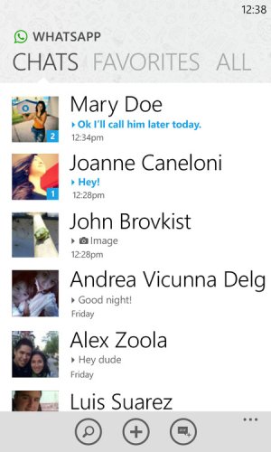
Hi everyone, my first post here. I decided to start working on a redesign mockup for WP's Whatsapp app.

You can see more and follow my progress in my personal blog
Comments and CC are very appreciated!

- If you are into WP app design you already know where I stole the style from the topbar. I think this style looks really good (especially on high resolution phones like the Lumia 920). It saves space, and honestly, we don?t need pivots THAT huge.
- I decided to add the nice little background with the doodles Whatsapp likes so much to put everywhere. Hey, I don?t blame them, it actually looks kinda nice.
- I made the app white. Why? Well, some insist that apps with black backgrounds are the design signature of Metro UI but I disagree. We have TOO many apps looking all the same. White themed apps on Windows Phone look gorgeous and take for account that the most important and best apps are using white themes.
- Taking advantage of the saved space above, I made the profile images slightly bigger than what they currently are, and I did this for two reasons: One, Everyone LOVES LOOKING AT PROFILE PICS (no, seriously), and two, it allows me to align Last Message and the time/date to the same side so that Names don?t get cut off by the Date that is currently aligned towards the right.
- In addition as a nice touch, I put the new message count in a little square on top of the profile picture.
- The search, new and status buttons in the app bar stay the same.
You can see more and follow my progress in my personal blog
Comments and CC are very appreciated!

