- Apr 7, 2015
- 31
- 0
- 0
https://www.behance.net/gallery/27500265/Reimagining-Windows-10-Mobile-Update-2
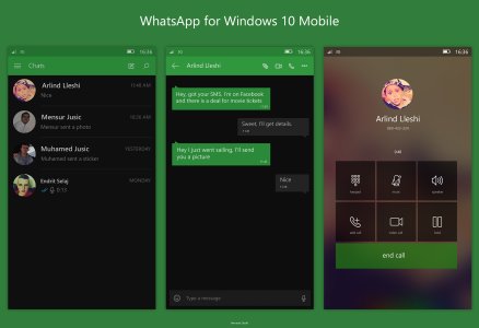
(best n beautiful ui/ux design for whatsapp on windows 10 mobile)
What u say...?
(best n beautiful ui/ux design for whatsapp on windows 10 mobile)
What u say...?
 !!
!!")


 Twitter