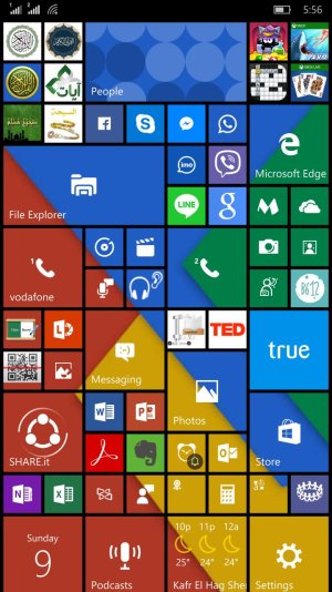
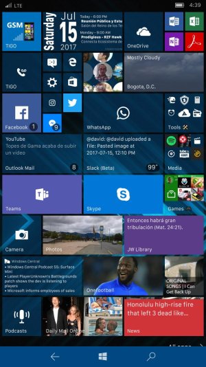
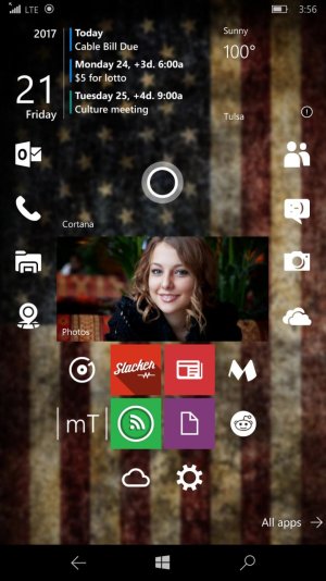
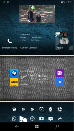
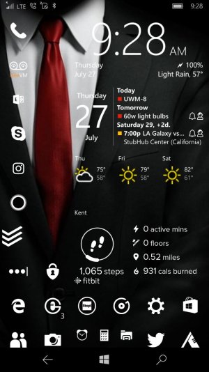
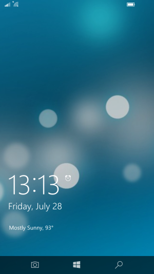
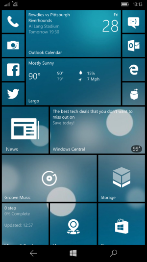
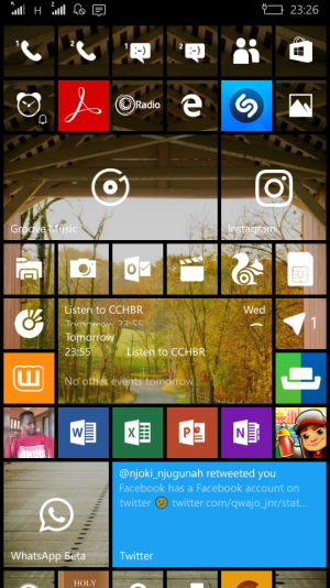
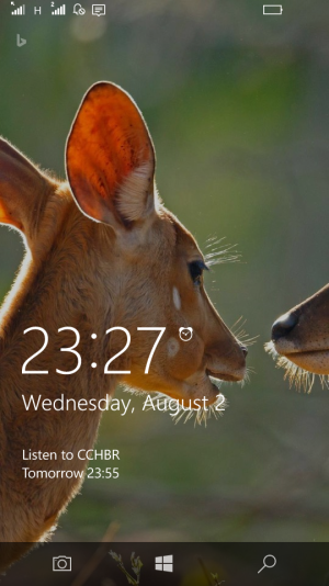
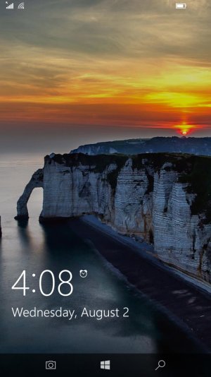
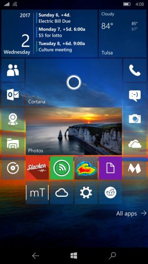
This is my screen, It took me along time to create it like what I want it to be, I import background from windows site but I customize it like this and I love it very much.....
What do you think about it, It need any editing....Please give me your feedback??
Thank you.
First and foremost, as long as you "love it very much", no amount of input from other users as to what to change really should matter. If the layout and look is what you like, then stick with it. That's the beauty of the UI, in that you can make it look just the way you want it to.
Now, as to my personal opinion on the layout: I think there are a few tiles which are not transparent that could possibly be moved to better align themselves with the background. But since I don't know what criteria you used to group icons together, I'm not sure it would make sense to move them.
For example, the first icon in the third row has a green background and is in a blue section, while the last icon in the seventh row (B612) has a blue background in a green section. Swapping them may make the appearance a little better, but as to the functionality of those apps, it may not make sense to move them away from similar apps.
Whereas, just swapping the positions of the "line" and "g" apps (Sorry, I don't know the actual app names) on the fifth line would still keep them grouped together, but make their backgrounds more closely match the underlying background colors.
In the end, it all comes back to my first statement: If you like it, then don't change a thing.

