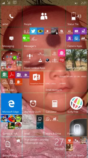
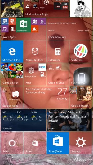
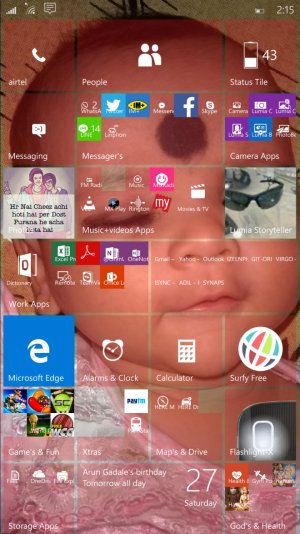
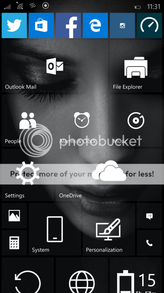
Share your W10M Start Screens and Backgrounds!
- Thread starter Laura Knotek
- Start date
You are using an out of date browser. It may not display this or other websites correctly.
You should upgrade or use an alternative browser.
You should upgrade or use an alternative browser.
superhik994
New member
- Sep 21, 2014
- 3
- 0
- 0
Lumious
New member
- Jun 16, 2015
- 550
- 0
- 0
Looks great! I really like the fact that you now have the choice to make the titles completely transparent so that don't even appear as tiles anymore. Now you have the option to make your phone look just like icons like iOS or android. But with a twist, they are still live! Now Windows Phones definitely have the most customization no one can argue that!
ThakurNikhil
New member
- Jun 18, 2015
- 19
- 0
- 0
weaksauce27
New member
- Nov 14, 2012
- 121
- 0
- 0
Well I thought my lumia 920 should dress a bit more formal for the arrival of the newest build 10136, so here is mine
Hows the stability with the new build on your 920? I had to revert back to 8.1 but I really do miss messing with the new homescreen.
Okay, after a lot of testing, I have discovered this:
Don't cut images to your native resolution. The OS is reintroducing parallax scrolling, which means your wallpapers need to fill a gutter partway off the bottom of the screen into which the view can move. If the phone is given a 1080p wallpaper, it will stretch it to a large size to fill all this space, making a blurry image. The screen will also use the rightwards space to scroll a little to the right when entering the app list menu.
So, your wallpaper must be 1297 (width) x 2300 (height).
Example image: here's another Tomer Hanuka image I was trying out. http://i.imgur.com/jkYUcjb.jpg

I don't know if there's a proportional relationship here which remains true for other screen resolutions.
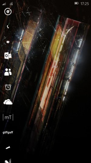
Current L930 layout (tiles continue off the bottom of the screen for the "reel" effect I was using last time):
Don't cut images to your native resolution. The OS is reintroducing parallax scrolling, which means your wallpapers need to fill a gutter partway off the bottom of the screen into which the view can move. If the phone is given a 1080p wallpaper, it will stretch it to a large size to fill all this space, making a blurry image. The screen will also use the rightwards space to scroll a little to the right when entering the app list menu.
So, your wallpaper must be 1297 (width) x 2300 (height).
Example image: here's another Tomer Hanuka image I was trying out. http://i.imgur.com/jkYUcjb.jpg

I don't know if there's a proportional relationship here which remains true for other screen resolutions.
Current L930 layout (tiles continue off the bottom of the screen for the "reel" effect I was using last time):

Last edited:
angelblast1997
New member
- Nov 27, 2014
- 60
- 0
- 0
angelblast1997
New member
- Nov 27, 2014
- 60
- 0
- 0
Mladen Mikovic
New member
- Mar 15, 2013
- 21
- 0
- 0
I saw some of you have transparet tile for Project Spartan, how can I do that? L920 build 10136
Narciso Neto
New member
- Mar 30, 2014
- 118
- 0
- 0
angelblast1997
New member
- Nov 27, 2014
- 60
- 0
- 0
I need a Windows phone with a large screen so I can get those 4 columns. But Im waiting for Microsoft to release a new flagship. I have a 1020 and the screen is too small for my taste.
Last edited:
Motor_Mouth
Banned
- Jan 3, 2013
- 222
- 0
- 0
Here's mine. The image is one of a series of 3D renderings of someone's idea of how the Chinese Pak-Fa fighter jet might look. I have played around with it a bit, adding the ocean/beach look to the background and resizing the aircraft to fit in with my icons a little better. I had to adjust it over the weekend to accommodate the new parallax style in Build 10136. I also put a tiny bit of transparency back into the tiles, just to ground them a little bit better, but I think that eventually Microsoft will sort out the tiny icon issue, at which point I wont' need to see the tiles at all.


alex athanasopoulos
New member
- Sep 14, 2013
- 180
- 0
- 0
Hows the stability with the new build on your 920? I had to revert back to 8.1 but I really do miss messing with the new homescreen.
Sorry i am late but i just checked the forum.
I have it to my Lumia 920 and its my only phone. Its pretty stable, with fewer bugs. For me they aren't annoying or a deal-break, but it depends on the usage. So far i didn't have any random reboot or a major crush, bug. But this is my personal experience. I don't know if in a different model or in a carrier phone will work the same. But i saw in video reviews that in the newer high-end phones like L930 or L1520 the w10m 10136 was faster.
So here are some features, bugs
- I haven't had any problem making calls or answering, getting texts but there are app crashes, like messenger, viber ( i can receive notifications, but sometimes both apps crashes when i try to type a message).
- The new store is stable enough, it is a bit slow but its better than in 10080. All new universal apps age better (To see the changes first update all the new apps from the beta store). Although i faced a problem with outlook mail, the app for me couldn't open at all (since Friday it can). The calender works finel.
- The music app and video app are awesome and feel solid. Like the map app (i don't know about car directions as i don't drive). I have no idea about games, as i don't play any.
- The office apps are very good and useful to make changes to documents. I dont know if excel is helpful.
- And now about cortana. She is simply awesome. She has a fresher UI much better and more mature than ever. She now takes better commands than in previous builds and she is faster. (but cortana's live tile is blank. It doesnt show anything)
- About spartan. Hands down the best browser ever. It is fast and fluid. The reading mode is great. (We can again download photos.)
About UI - The scaling bug is gone. The elements, icons, letters are big enough. (Although i loved the smaller ones).
- The UI is more consistent, unified. It feels fresh.
- The action center is better than before. They changes the icons and also the gave us the ability to swipe down to make the extra toggles appear and swipe up to disappear. (sometimes it doesn't work and may feel a bit sluggish). To open the toggles you can now swipe down and swipe up like you do with the cation center. (it doesnt work always).
- The resuming isn't gone entirely, but i don't see it very often. I usually see it at the startsceen when an app is crashed or something like that.
To sum up. For me the phone works great with the 10136 build but it depends on the usage. The battery is good enough for a medium-light use.
P.S. If you upgrade to the 10136 check for new updates. I got a new one that fixed a few problems and made the phone even more stable. Some say that doing a hard reset will make the experience smoother, but i haven't tried it in this build so i wont advice you to do this. And last but not least update first the store app and then the others. The new store app version is way faster and stable than before.
Santosh Gadaley
New member
- Dec 10, 2014
- 5
- 0
- 0
vw1610
New member
- Oct 14, 2013
- 204
- 0
- 0
Similar threads
- Replies
- 0
- Views
- 1K
- Replies
- 0
- Views
- 3K
- Replies
- 2
- Views
- 22K
- Question
- Replies
- 0
- Views
- 5K
Trending Posts
-
-
Question Win-11 - Problem with moving files from C: to New Partition on E:
- Started by fasteddie01
- Replies: 2
-
Question Windows 11 and Linux on separate drives?
- Started by Verax
- Replies: 2
-
-
I'm looking for a CalDAV, CardDAV client for Windows
- Started by xandros9
- Replies: 1
Forum statistics

Space.com is part of Future plc, an international media group and leading digital publisher. Visit our corporate site.
© Future Publishing Limited Quay House, The Ambury, Bath BA1 1UA. All rights reserved. England and Wales company registration number 2008885.



![wp_ss_20150620_0001[1].jpg wp_ss_20150620_0001[1].jpg](https://windowscentral-data.community.forum/attachments/73/73977-0c61c01fe7a3525e8a407888cb201789.jpg?hash=DGHAH-ejUl)
![Blue-Floral-Ornament-Pattern-iPhone-6-Wallpaper[1].jpg Blue-Floral-Ornament-Pattern-iPhone-6-Wallpaper[1].jpg](https://windowscentral-data.community.forum/attachments/73/73979-bc35c28b8b799e3118b8562949d65594.jpg?hash=vDXCi4t5nj)
![wp_ss_20150622_0001[1].jpg wp_ss_20150622_0001[1].jpg](https://windowscentral-data.community.forum/attachments/74/74085-132e280dd7de90561b53fe72082a21c7.jpg?hash=Ey4oDdfekF)
![wp_ss_20150622_0002[1].jpg wp_ss_20150622_0002[1].jpg](https://windowscentral-data.community.forum/attachments/74/74088-af7836fb0da01c9010975b25b64c4ed3.jpg?hash=r3g2-w2gHJ)


