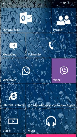
Share your W10M Start Screens and Backgrounds!
- Thread starter Laura Knotek
- Start date
You are using an out of date browser. It may not display this or other websites correctly.
You should upgrade or use an alternative browser.
You should upgrade or use an alternative browser.
Geo Hutchings
New member
- Mar 1, 2015
- 451
- 1
- 0
avinash123
New member
- Aug 31, 2012
- 10
- 0
- 0
avinash123
New member
- Aug 31, 2012
- 10
- 0
- 0
Neill Baldwin
New member
- May 16, 2015
- 109
- 0
- 0
new legend
New member
- May 16, 2015
- 1
- 0
- 0
Jonnie LasVegas
New member
- May 15, 2014
- 372
- 0
- 0
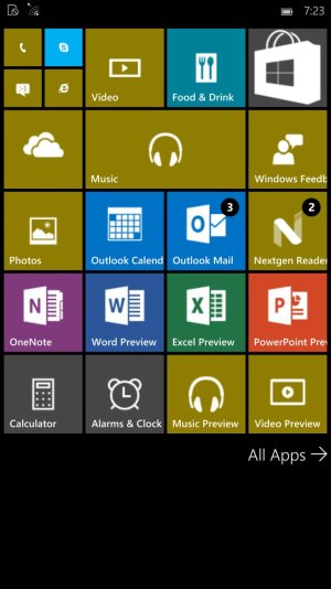
Am I the only one who got an additional row on the start screen?!
View attachment 104723
I installed the latest build on a Lumia 1520.
I've got them as well. Even when I try to switch to less tiles it doesn't change. I don't hate it, but don't necessarily like it either.
Albert_Elliot
New member
- Feb 26, 2013
- 20
- 0
- 0
Neill Baldwin
New member
- May 16, 2015
- 109
- 0
- 0
For me, I use a app called blank tiles. Just make a bunch of blank tiles and insert them in the middle. I set the start screen to "tiles" to set it up, and then switched to full
Donny James
New member
- Jun 13, 2013
- 279
- 0
- 0
Am I the only one who got an additional row on the start screen?!
View attachment 104723
I installed the latest build on a Lumia 1520.
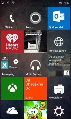
Hey can you confirm that they fixed the background shrinking bug from last build. If your not familiar with it. It's when you set and image as the background wallpaper and after a while the image would not be taking up the whole background anymore. The image would shrink and take only 3 quarters of the background and the rest would be Black or White. On the 1520.
Jonnie LasVegas
New member
- May 15, 2014
- 372
- 0
- 0
Hey can you confirm that they fixed the background shrinking bug from last build. If your not familiar with it. It's when you set and image as the background wallpaper and after a while the image would not be taking up the whole background anymore. The image would shrink and take only 3 quarters of the background and the rest would be Black or White. On the 1520.
It is still there for me, unfortunately.
Daniel Ivascu
New member
- Nov 9, 2014
- 6
- 0
- 0
thephiri2point1
New member
- Apr 14, 2014
- 119
- 0
- 0
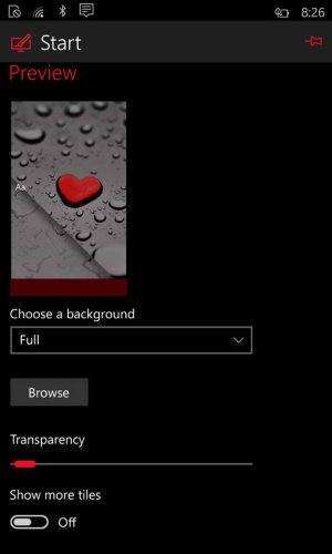
How did you made it look that way? Transparency slider is in this build? If yes, pls take a screenshot of it
Nice
weaksauce27
New member
- Nov 14, 2012
- 121
- 0
- 0
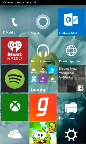
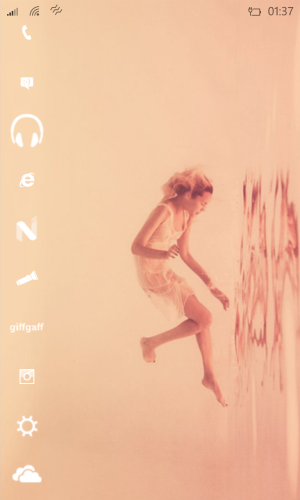
Thanks! The line goes on further below the screen for a few more icons, ones I don't need as often. It feels completely different when you scroll like this, like it's a different UI: more like rolling a reel.
This is the resized image for 1280 res screens, if you want it: http://i.imgur.com/GBeqGxP.jpg
I'm using the slightly pink-looking orange from 6 squares down the first column of the colour picker as my accent colour, which I expect won't be to everyone's taste but it feels like the most fitting one when you're leaving Start to go to another page.
[edit] A weird thing I've noticed: the Start page tends to refocus on important MS apps such as Outlook. I hate the way Outlook has a solid blue tile, so I tucked it away off the bottom of the screen in the arrangement shown in the screenshot. It was annoying me for a while, because everytime I reopened Start it would automatically open with Outlook in shot, so I'd have to scroll back until Phone was at the top.
However, I experimented a bit and eventually found that putting Music Preview to the top stopped that behaviour. Now it opens in the arrangement I wanted, albeit without Phone at the very top.
Similar threads
- Replies
- 0
- Views
- 1K
- Replies
- 0
- Views
- 3K
- Replies
- 2
- Views
- 22K
- Question
- Replies
- 0
- Views
- 5K
Trending Posts
-
-
Question Win-11 - Problem with moving files from C: to New Partition on E:
- Started by fasteddie01
- Replies: 2
-
Question Windows 11 and Linux on separate drives?
- Started by Verax
- Replies: 2
-
-
I'm looking for a CalDAV, CardDAV client for Windows
- Started by xandros9
- Replies: 1
Forum statistics

Space.com is part of Future plc, an international media group and leading digital publisher. Visit our corporate site.
© Future Publishing Limited Quay House, The Ambury, Bath BA1 1UA. All rights reserved. England and Wales company registration number 2008885.

