Share your W10M Start Screens and Backgrounds!
- Thread starter Laura Knotek
- Start date
You are using an out of date browser. It may not display this or other websites correctly.
You should upgrade or use an alternative browser.
You should upgrade or use an alternative browser.
Elitewolverine
Banned
- Jan 19, 2014
- 26
- 0
- 0
Motor_Mouth
Banned
- Jan 3, 2013
- 222
- 0
- 0
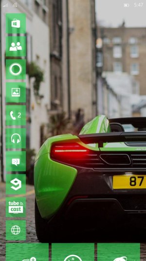
I haven't installed W10 yet, I'll wait for a release, but I've uploaded some blurred background images that I think will work really well with transparent tiles. You can grab them from here - W10 Phone Backgrounds - Album on Imgur
Feel free to do whatever you like with them but it would be great to see some screen grabs of W10 running with them. BTW, the last one is my current WP8 wallpaper, featuring a tarted up version of my car. Below is a sample of the type of images included.
Feel free to do whatever you like with them but it would be great to see some screen grabs of W10 running with them. BTW, the last one is my current WP8 wallpaper, featuring a tarted up version of my car. Below is a sample of the type of images included.


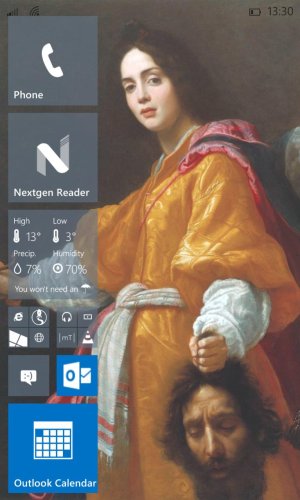
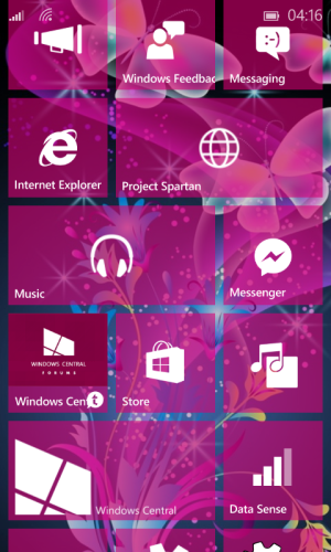
I hope there are going to be options about the slight translucency of wallpapers. I realise that it's a smart way to solve two problems at once: it separates the art from the tiles by washing it out slightly, and it allows the dark status symbols to show up even on wallpapers with dark backgrounds. Unfortunately it wrecks the richness of some images, and users of the dark theme get comparatively dull Start screens due to the black leaking through. This is how that painting is supposed to look:

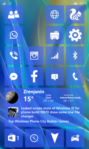
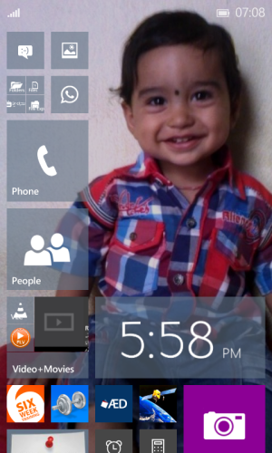
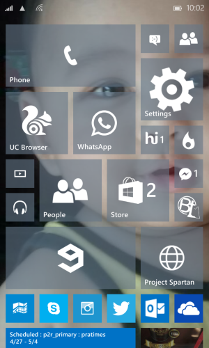
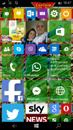
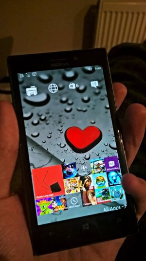
People's creativity always astounds me when it comes to how the Start Screen's arranged. (as proof of that, I haven't had time to rearrange my screen yet ;___
I do have a question, though. I've been debating to try what DCTF and others have been doing (minimalist start screens), but part of it is inertia and part of it is what "workflow" I have on my phone works. I'm assuming you guys find it easy enough to use your phones in that fashion, or don't mind going to the app list to open apps that might not be on the screen?
There are different ways to handle it. You can make the main chunk of the screen with this minimal look, maybe giving preference to the tiles that give you notifications that you need to see most, and then leave a pool of icons filling the screen below (so you only see them if you scroll).
You could make lots of use of combined folder tiles, but obviously that's only good for tiles which can remain static, and for which you need no notifications.
Otherwise, it's just a case of being very strict about how much you really need a Start tile. I realised, for example, that I don't really need People (the app, not... you know what I meant). It's accessible within Phone, so the extra tile is redundant. I'm very much hoping that Outlook will behave as a single app tile in the final WP10 - they're the same app, so it would be nice to have a single tile that flips between email alerts and calendar info. Do we really need maps on the Start screen? Probably not, but there will be days when we do. That's partly why I added that scatter of small tiles. It's partly because I like the look of it and the way it makes the illusion of depth, but it's also so I can throw a tile on that I need for that day. If I'm going to be in London, I can throw on the Tube Map app for that day, or if I'm going to an unfamiliar city I can add Here street maps or the City Lens.
anon(9106526)
New member
- Sep 25, 2014
- 37
- 0
- 0
Frida Kahlo by Mar?a D?az Perera (resized/Smart Sharpened in PS)
https://www.behance.net/gallery/15660717/Bella-Frida
![wp_ss_20150429_0002[1].jpg wp_ss_20150429_0002[1].jpg](https://windowscentral-data.community.forum/attachments/70/70524-e866c3d350357065ac24a401b049aff7.jpg?hash=6GbD01A1cG)
https://www.behance.net/gallery/15660717/Bella-Frida
![wp_ss_20150429_0002[1].jpg wp_ss_20150429_0002[1].jpg](https://windowscentral-data.community.forum/attachments/70/70524-e866c3d350357065ac24a401b049aff7.jpg?hash=6GbD01A1cG)
Last edited:
thephiri2point1
New member
- Apr 14, 2014
- 119
- 0
- 0
Duy Nguyen 8s
New member
- Apr 29, 2015
- 14
- 0
- 0
Don Geronimo
New member
- Aug 22, 2014
- 199
- 0
- 0
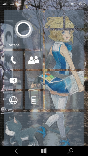
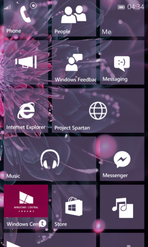
I'm getting antsy for more tile screen customizations as well. Any road. It's Inori Aizawa from one of Microsoft's desktop wallpapers promoting Internet Explorer, cut out and 'sketched' using a GIMP filter, then put on the Start Screen using #TileArt. The actual background is a picture of Paris I had in my stuff of random pictures that I 'sketched' using the same filter.
Any road, thanks @DCTF. I'm trying to just put on the screen the tiles that I absolutely need/want on an everyday basis. I'll re-negotiate with myself later if I need/want more.
Last edited:
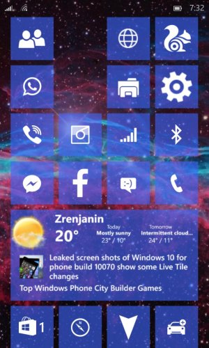
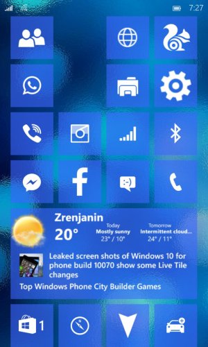
I posted this previously in a dead thread so here it is again. I've actually gone back to 8.1 for now, but will return once 10080 is released.
Geo Hutchings
New member
- Mar 1, 2015
- 451
- 1
- 0
Narciso Neto
New member
- Mar 30, 2014
- 118
- 0
- 0
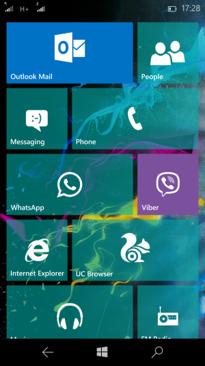
How did you made it look that way? Transparency slider is in this build? If yes, pls take a screenshot of it
Geo Hutchings
New member
- Mar 1, 2015
- 451
- 1
- 0
How did you made it look that way? Transparency slider is in this build? If yes, pls take a screenshot of it
Yeah it is
Similar threads
- Replies
- 0
- Views
- 990
- Replies
- 0
- Views
- 3K
- Replies
- 2
- Views
- 22K
- Question
- Replies
- 0
- Views
- 5K
Trending Posts
-
-
-
Windows 10 Themes no longer working...
- Started by DocCovington
- Replies: 6
-
I'm looking for a CalDAV, CardDAV client for Windows
- Started by xandros9
- Replies: 1
Forum statistics

Space.com is part of Future plc, an international media group and leading digital publisher. Visit our corporate site.
© Future Publishing Limited Quay House, The Ambury, Bath BA1 1UA. All rights reserved. England and Wales company registration number 2008885.

