Share your W10M Start Screens and Backgrounds!
- Thread starter Laura Knotek
- Start date
You are using an out of date browser. It may not display this or other websites correctly.
You should upgrade or use an alternative browser.
You should upgrade or use an alternative browser.
weaksauce27
New member
- Nov 14, 2012
- 121
- 0
- 0
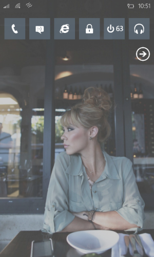
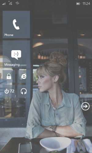
Beginning to think that kind of layout is the smart way to go!
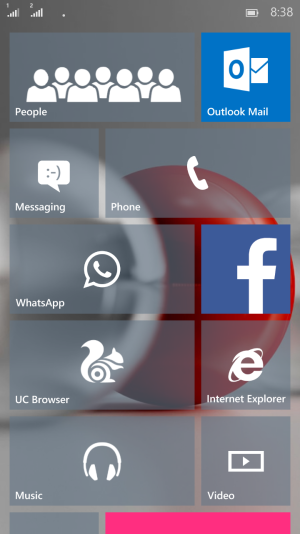
It's really hard to fill the screen and make it look good, especially with the fixed opaque blue backgrounds on the Outlook apps. Even a texture with too much detail looks bad.
Mine's like this at the moment, which isn't ideal but it's alright.
![wp_ss_20150413_0003-thumb[1].jpg wp_ss_20150413_0003-thumb[1].jpg](https://windowscentral-data.community.forum/attachments/66/66636-3e33be70f9bc0a5d85574d141877ea9a.jpg?hash=PjO-cPm8Cl)
I'm stuck on wanting the Taupe theme colour because it makes a great black/white/gold look in the Settings pages, so I have to try and find backgrounds that work with that. Going to try a de-cluttered one a bit like yours, once I find a photo I like!
Jonnie LasVegas
New member
- May 15, 2014
- 372
- 0
- 0
Nice! I hadn't thought of doing something like this. Really clean and nice.
Can anyone tell me what resolution my images need to be for a Lumia 920? I know it's a 768x1280 screen, but the phone stretches images of that size beyond the edges of the screen, in order to make the parallax effect when scrolling. I'm trying to get an accurate position for some elements. Thanks!
weaksauce27
New member
- Nov 14, 2012
- 121
- 0
- 0
Last edited:
Joshwin
New member
- Jan 31, 2015
- 290
- 0
- 0
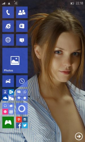
Thought about showing some love to Violet.. This a rough build of my start screen, just like WP 10 TP..
Posted via the Windows Phone Central App for Android
is it the new outlook calender on the top ?
mary beth hale
New member
- Mar 13, 2013
- 1,436
- 0
- 0
Love this layout! Can't wait to get 10 on my 930. Thanks for sharing.
thephiri2point1
New member
- Apr 14, 2014
- 119
- 0
- 0
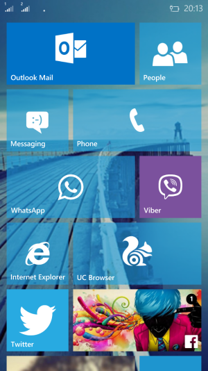
See, these are like unicorns - photo backgrounds that actually show through in a nice way on WP10!
I think that's a problem with this new system. The whites of the app icons are so strong and distinct, whereas the tiles and backgrounds are generally melting together in everyone's full coverage layouts. We have to use big tiles in order for photo backgrounds to show through in the tiles' negative space, but that then leaves these ultra-precise white shapes in positions that will almost never form a fully attractive arrangement (unless you use the same tile size/shape repeated). The components of the design are breaking apart instead of working together as one thing.
WP10 needs to find a way to allow a modular construction set to reliably form layouts that have the kind of balance that a good magazine page might have. Lots of people seemed to dislike the concept in Joshwin's post on the previous page but I really think that's the kind of look we need. It recognises that simply centring the icon works against the shapes set up by the tiles. It looks much better when visual information is balanced across a tile -- the headline and 1st para of your News app's Live Tile when it flips, your tiles that feature full photos.
Jonnie LasVegas
New member
- May 15, 2014
- 372
- 0
- 0
akshaypn
New member
- Oct 11, 2013
- 351
- 0
- 0
is it the new outlook calender on the top ?
No, it's good old "Simple Calendar" and its Frodo tile..
Posted via the Windows Phone Central App for Android
Irfan Zevan
New member
- Apr 14, 2015
- 2
- 0
- 0
Michael Amiro
New member
- Jun 26, 2014
- 1
- 0
- 0
how do you set the background on the start screen with transparent tiles? I'm running WP 10 preview for developers on my L625 OS version 10.0.12534.56
how do you set the background on the start screen with transparent tiles? I'm running WP 10 preview for developers on my L625 OS version 10.0.12534.56
I'm not sure what you mean, so perhaps there's something wrong with your installation or maybe I've misunderstood you. Tiles are translucent automatically, and the only ones that appear opaque are the ones that the app developers fixed to be that way.
Even if you don't load a background image, the tiles are still the same translucency (so tiles will look dull on a dark theme and slightly pastel on a light theme, unlike in 8.1 where having no background would give you tiles in your theme colour with 100% opacity). I expect we'll have more options eventually, but at the moment that's how it is.
Don Geronimo
New member
- Aug 22, 2014
- 199
- 0
- 0
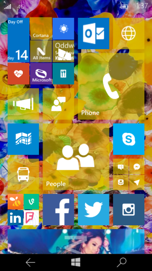
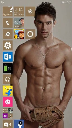
The background is the Bellagio lobby's glass flower ceiling, cropped and modified using Photoshop Express. I wanted a bold and flamboyant color scheme that would go with a yellow Lumia 635 shell and matching yellow earbuds.
I try to arrange my live tiles in an asymmetric fashion for the most part, though they are (mostly) grouped by function and use. There is, indeed, a method to the madness.
Last edited:
Similar threads
- Replies
- 0
- Views
- 1K
- Replies
- 0
- Views
- 3K
- Replies
- 2
- Views
- 22K
- Question
- Replies
- 0
- Views
- 5K
Trending Posts
-
-
Question Win-11 - Problem with moving files from C: to New Partition on E:
- Started by fasteddie01
- Replies: 2
-
Question Windows 11 and Linux on separate drives?
- Started by Verax
- Replies: 2
-
-
I'm looking for a CalDAV, CardDAV client for Windows
- Started by xandros9
- Replies: 1
Forum statistics

Space.com is part of Future plc, an international media group and leading digital publisher. Visit our corporate site.
© Future Publishing Limited Quay House, The Ambury, Bath BA1 1UA. All rights reserved. England and Wales company registration number 2008885.


![wp_ss_20150414_0001[1].png wp_ss_20150414_0001[1].png](https://windowscentral-data.community.forum/attachments/67/67358-472f46f14b03f47d9008ada503b3c666.jpg?hash=Ry9G8UsD9H)
