Stardock Start10 - What is the point?

Scott Bradley

New member
May 1, 2014
99
0
0
Visit site
So I have been running Stardock Start8 on my Windows 8.1 Surface Pro since the moment I found it. Not because I love the Windows 7 start menu, simply because I never found the tile based UI to be particularly useful - especially in desktop mode.

I see a whole bunch of tweets and posts from Stardock advertising their new Start10 product. I think the popularity of Start8 even took Stardock by surprise - so no surprise that they would want to milk that cash cow as long as possible.

But, while a third party tool was a very desirable addition for Windows 8, what is the point in Windows 10? It doesn't add any functionality, it doesn't make it easier to navigate or find content, heck it doesn't even match the design scheme of the OS. Wouldn't you at least give Windows 10 start menu a try before plopping down another $4, just because you are afraid of change?

Thoughts?
 

princeegli

New member
Mar 2, 2014
189
0
0
Visit site
Alot of people,including myself....do not like Mobile ui on our desktop....we don't have yo try it,because we already use mobile ui(Microsoft want to market it as a modern ui) on our phones.
 

cgk

New member
Nov 25, 2011
584
0
0
Visit site
So I have been running Stardock Start8 on my Windows 8.1 Surface Pro since the moment I found it. Not because I love the Windows 7 start menu, simply because I never found the tile based UI to be particularly useful - especially in desktop mode.

I see a whole bunch of tweets and posts from Stardock advertising their new Start10 product. I think the popularity of Start8 even took Stardock by surprise - so no surprise that they would want to milk that cash cow as long as possible.

But, while a third party tool was a very desirable addition for Windows 8, what is the point in Windows 10? It doesn't add any functionality, it doesn't make it easier to navigate or find content, heck it doesn't even match the design scheme of the OS. Wouldn't you at least give Windows 10 start menu a try before plopping down another $4, just because you are afraid of change?

Thoughts?
I have left the default on my laptop and have installed start10 on my desktop to see which I prefer - at the moment I perfer start10 but I will see how I go over the next couple of months with it on the laptop.

I guess the reason is that I have a workflow that work and there is nothing in the ten menu that makes it worth changing that workflow. I don't use any of the live tiles for any reason (They are just clutter to me - the sort of information they provide I just don't need or want on my desktop machine, I have other devices for that - I fire up outlook, word and excel and live in them all day).
 

Scott Bradley

New member
May 1, 2014
99
0
0
Visit site
I have left the default on my laptop and have installed start10 on my desktop to see which I prefer - at the moment I perfer start10 but I will see how I go over the next couple of months with it on the laptop.

I guess the reason is that I have a workflow that work and there is nothing in the ten menu that makes it worth changing that workflow. I don't use any of the live tiles for any reason (They are just clutter to me - the sort of information they provide I just don't need or want on my desktop machine, I have other devices for that - I fire up outlook, word and excel and live in them all day).

You realize you can remove the live tiles if you want by simply right clicking on the tile and selecting unpin tile...

And that is the point... I just don't get it - the app explorer is far more powerful in Window 10 then it was in Windows 7, File, Documents, Settings, Power, all at your finger tips.

The Windows 7 menu has less functionality than the Windows 10 menu with a design that actually fits the theme. It "seems" more like a resistance to change than a question of functionality or need. (far different than Start8 in the windows 8 environment)

Not trying to degrade anyone who wants to use Start10 - free world and Stardock can sell it. I just don't understand the desire to pay for it.
 

cgk

New member
Nov 25, 2011
584
0
0
Visit site
Its not even the price of a cup of coffee so the money is irrelevant - can you give me an practical example of something that would be quicker?? (ie something worth me changing my workflow).
 

Scott Bradley

New member
May 1, 2014
99
0
0
Visit site
Its not even the price of a cup of coffee so the money is irrelevant - can you give me an practical example of something that would be quicker?? (ie something worth me changing my workflow).

Well, I obviously have no idea what you mean by "work flow".

Both menu's have "Most Used" applications listed at the top of the menu. Both Menu's have Documents, and the ability to access File Explorer, Settings and Power in a similar manner.

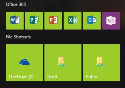
The improved access under the Windows 10 menu is around All Apps browser and the contextual Search Mechanism (I assume Start10 leverages the search improvements) and the ability to pin other live tiles to create an active menu. On the live tile menu, I have among other things:

- small shortcuts for my office apps,
- Medium shortcuts for network shares that I use all the time.
- I also have a large tile for calendar view for a great quick reference

And a few others, but that is frankly personal preference... The point is that the Windows 10 Menu is far more flexible and configurable than the Windows 7 menu. It can practically look the same as the W7 menu, if that is what you want, but the W7 menu is pretty rigid in it's design - it is what it is - that just isn't true for the W10 menu.

FullSizeRender.jpg

I am sure Stardock will continue to push the fear of the "new" to get early adopters to purchase their product as soon as possible. You sure don't want the users getting used to the new UI! :)
 

cgk

New member
Nov 25, 2011
584
0
0
Visit site
I don't get why you would pin the items you have there on a start menu and introduce another click - office I have on the taskbar pinned (one click), short-cut to drives on the desktop (one click).


I am sure Stardock will continue to push the fear of the "new" to get early adopters to purchase their product as soon as possible. You sure don't want the users getting used to the new UI! :)

you did read the bit where I said I have the new start menu left untouched on my laptop to try it? (Plus I haven't actually paid for Start10).
 

Scott Bradley

New member
May 1, 2014
99
0
0
Visit site
I don't get why you would pin the items you have there on a start menu and introduce another click - office I have on the taskbar pinned (one click), short-cut to drives on the desktop (one click).

That is preference, I do not like a lot of garbage on my task bar. I like it as a quick glance to see what is open at the moment.
 

Steve Thackery

New member
Jun 23, 2015
271
0
0
Visit site
Actually, there are several advantages. Most of them come down to being able to control what goes on the Start menu.

1/ This is the biggest failure: I cannot pin programs to the Start menu EXCEPT as a live tile. I hate live tiles on my workstation machine, but I want some programs pinned to the Start menu. Early Beta versions of W10 let you drag a tile to the left and it became a pinned icon/text entry. Now I can't do that.

2/ W10 - I cannot remove the 'Most Used' list. I don't want it, because the list keeps changing (obviously) so I can't use my "muscle memory" to navigate to the program I want quickly.

3/ W10 - I cannot remove the 'Recently Added' list. I don't want it, for the same reason as 1/

4/ W10 - I cannot remove the 'File Explorer' icon (I prefer it on my Taskbar, so this is unwanted duplication).

In summary, there's a load of visual noise on the Start menu that I cannot get rid of, and I can't pin my preferred programs as an icon/text entry - it has to be a live tile. All of the above shortcomings are address by Start10.
 

Steve Thackery

New member
Jun 23, 2015
271
0
0
Visit site
I don't get why you would pin the items you have there on a start menu and introduce another click - office I have on the taskbar pinned (one click), short-cut to drives on the desktop (one click).

I have a three tier system:

Taskbar - ONE click - my most frequently used programs (MS Office, email, browser, graphics editor, File Explorer)

Start menu - TWO clicks - less frequently used programs, but easy access required (Visual Studio, video editor, web site builder, audio editor)

'All Programs' - THREE clicks (or more) - rarely used programs (hex editor, Skype, Visuino and all the rest of the stuff)

This works brilliantly for me. Unfortunately I cannot pin anything to the Start menu EXCEPT as a live tile, which I hate on my workstation, so that's why I'm using Stardock Start10.
 

Rasetech

New member
Jan 31, 2014
498
0
0
Visit site
I tell you whats the quickest way to open programs. Pressing start and simply typing the programs name and hit enter. you dont even have to leave the keybord or have to look anywhere to find the right menu. Works since Win 7 and people who work this way never understood the complaining about the windows 8 start screen.
 

Qre8ive

New member
Jan 18, 2015
6
0
0
Visit site
Actually, there are several advantages. Most of them come down to being able to control what goes on the Start menu.

1/ This is the biggest failure: I cannot pin programs to the Start menu EXCEPT as a live tile. I hate live tiles on my workstation machine, but I want some programs pinned to the Start menu. Early Beta versions of W10 let you drag a tile to the left and it became a pinned icon/text entry. Now I can't do that.

2/ W10 - I cannot remove the 'Most Used' list. I don't want it, because the list keeps changing (obviously) so I can't use my "muscle memory" to navigate to the program I want quickly.

3/ W10 - I cannot remove the 'Recently Added' list. I don't want it, for the same reason as 1/

4/ W10 - I cannot remove the 'File Explorer' icon (I prefer it on my Taskbar, so this is unwanted duplication).

In summary, there's a load of visual noise on the Start menu that I cannot get rid of, and I can't pin my preferred programs as an icon/text entry - it has to be a live tile. All of the above shortcomings are address by Start10.

1/ You can easily make tiles really small so they are only an icon and don't show any live info which basically is exactly what you want to do, only they stay on the right rather then the left.

2/ You can disable it: Settings > Personalization > Start

3/ See answer 2

4/ So you rather see links to "startdock, documents, pictures, music, games, this pc, control panel, etc etc" then 1 link to explorer?

Nice sales pitch for Start10 xD
 

cgk

New member
Nov 25, 2011
584
0
0
Visit site
I tell you whats the quickest way to open programs. Pressing start and simply typing the programs name and hit enter. you dont even have to leave the keybord or have to look anywhere to find the right menu. Works since Win 7 and people who work this way never understood the complaining about the windows 8 start screen.

Even quicker in 10 - after you disable cortana, you end up (if you want it) with a search windows box, so no need to press start.

1/ You can easily make tiles really small so they are only an icon and don't show any live info which basically is exactly what you want to do, only they stay on the right rather then the left.

2/ You can disable it: Settings > Personalization > Start

3/ See answer 2

4/ So you rather see links to "startdock, documents, pictures, music, games, this pc, control panel, etc etc" then 1 link to explorer?

Nice sales pitch for Start10 xD

Do you happen to know how to remove the clunky Letter dividers on the W10 start menu? - I've kept it on the laptop and if I could remove that it would make it a bit better.
 

Rasetech

New member
Jan 31, 2014
498
0
0
Visit site
Even quicker in 10 - after you disable cortana, you end up (if you want it) with a search windows box, so no need to press start.
Then you have to click inside the search bar with your mouse and you can also use cortanas box to search for apps the same way.
 

Qre8ive

New member
Jan 18, 2015
6
0
0
Visit site
Do you happen to know how to remove the clunky Letter dividers on the W10 start menu? - I've kept it on the laptop and if I could remove that it would make it a bit better.

You mean between the tiles? Those are tile-groups, you need at least one group but you can just click on the group name and leave it blank. Then just drag all tiles to this one group so there are no dividers anymore.
 

cgk

New member
Nov 25, 2011
584
0
0
Visit site
You mean between the tiles? Those are tile-groups, you need at least one group but you can just click on the group name and leave it blank. Then just drag all tiles to this one group so there are no dividers anymore.

No I deleted all the tiles - I mean in the app list in the left column (well the only column on my machine).
 

Qre8ive

New member
Jan 18, 2015
6
0
0
Visit site
No I deleted all the tiles - I mean in the app list in the left column (well the only column on my machine).

Ah no you can't remove those as far as i know. I'm kinda used to it since they use the exact same app list on mobile :)
 

Members online

No members online now.

Forum statistics

Threads
326,337
Messages
2,248,213
Members
428,482
Latest member
saira1122