What I'd like in a Start screen

Mathias Lindberg

New member
Sep 11, 2013
131
0
0
Removed
 

Attachments

  • Skærmbillede (801).png
    Skærmbillede (801).png
    15.7 KB · Views: 11
  • Skærmbillede (802).png
    Skærmbillede (802).png
    15.8 KB · Views: 13
Last edited:
I'm glad you're not the guy who makes decisions for WM. I agree, the app list isn't ideal, but I don't want an android clone for my phone either.
 
I'm glad you're not the guy who makes decisions for WM. I agree, the app list isn't ideal, but I don't want an android clone for my phone either.

That's not what Android currently looks like, and Android Marshmallow is an alphabetically sorted vertical list like Windows Phone, only with big icons.

Android-M-app-drawer.jpg
 
The grid view for the app list isn't a bad idea. As for the tiles, I don't mind the size of it. I like the start screen for the most parts. It's much better than the WP 8 start screen.
 
The grid view for the app list isn't a bad idea. As for the tiles, I don't mind the size of it. I like the start screen for the most parts. It's much better than the WP 8 start screen.I'm not really a fan of the multiple home screens. I always thought that's the reason we had the option to resize tiles, unlike the icons on an android. You can only fit so many icons on one screen on an android, thus the reason for multiple screens? Don't know...I could be wrong, but that's my interpretation. I also think the vertical scrolling is more of a natural motion.
 

I've always felt the homescreens were more about Android being a more desktop-like OS. Because you use the phone in portrait, and desktops are usually wide, they've segmented the Desktop into homescreens, where you can place the icons freely. I didn't develop Windows Phone, but my interpretation is that resizing tiles is about how much information you want on a tile, and how long you want to scroll when you're loooking for an app.

I don't mind the new tiles when I'm using a black background, because it blends in with the phone's borders around the screen itself, but when I'm using an image background, they start to look odd.
 
I also don't like the OP's idea. Didn't we get enough Android already? Horizontal homescreens would be one of the worst things (IMO) to happen to Windows (phone). The homescreen is good as it is now. The only changes I would make to the homescreen are:
-Landscape option, so it would be like the start screen in Windows 8.1
-Change the app list so that the search bar is hidden behind a search icon (you first tap the icon, then the field is revealed)
-Change the app list so it's a little more useful, and not so empty (however not the grid list, that sucks)
-Remove the 'All apps' shortcut that moves you to the apps list. It's useless, we all know where the app list is, it's the first thing you learn!
-Change the overlay on the start screen
What I mean by overlay is that there's a transparent white/black (depending on your theme) layer on top of your startscreen (where the tiles are) which just screws your picture. You can notice the diference easy, just compare the actual picture and the same picture as a background. You'll notice that the background is lighter/darker (depending on the theme), than the photo, which just makes it bad.
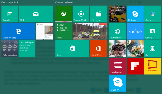

Windows 10's Start has horizontal homescreens, as did Windows 8.

Start.png

I disagree with hiding Search and removing the All apps and arrow. I don't feel confident giving a Windows Phone to an Android or iOs user, and I'd be even less confident if the Apps list was even more hidden. They should definitely remove the overlay. If the background doesn't work well with your tiles, pick a different background.
 
I've had a quick glance at these and from what I can see they look ok, but will need more time to mull over them. I'll have a think and see what I can improve in them.
 
Why can't Windows 10 UI increase the home-screens to 2+ kinda like Android has. And people can simply add tiles in which ever home-screen they want or can just keep it empty for a nice and calm wallpaper.
 
I've had a quick glance at these and from what I can see they look ok, but will need more time to mull over them. I'll have a think and see what I can improve in them.

There's a lot of errors in this, and I need to redo it to include the real size of tiles and other elements like the status bar at the top. I've been rethinking my idea, and this might be better for everyone:

Take the Apps list from Windows 10 Tablet mode (hide it behind a button, and put it on the left.)
Then take the functionality to add more "homescreens" from Windows 10 Desktop mode (dragging the Start menu to the right).

That means you won't be able to pin a Tile where ever you want, but you can put the majority of your Tiles on other "homescreens," to keep your main "homescreen" clean.
 
While I don't really have that much of an opinion on the op's ideas I do think it's worth mentioning (what I think is) the reasoning for the start screen in the first place. It's a place to access/glance your most used apps quickly. It's supposed to be the mobile version of the start menu (that arguably nobody uses). Do you really have 15+ apps that you need to access quickly? The multiple home screens on ios and android are there because that's mostly the ONLY way to access those apps, this is not the case for windows.

Op, you're going to have to be bit more careful in these parts. With all of the changes made to Win 10 mobile that have borrowed from ios/android (hamburgers anyone?), a lot of the hardcore here are totally against ANY ideas that will make windows mobile resemble anything like ios/android. Homescreens is basically a step too close, next thing you know somebody will be suggesting we add a toggle to shut off all live tiles and custom launchers...

Android has an app drawer, just like Windows has an All Apps list. As I've mentioned, this is about making Windows 10 Mobile into what I would like it to be, which is Windows 10 on a phone. That includes the multiple "homescreens" that you get on Windows 10.
 
Android has an app drawer, just like Windows has an All Apps list. As I've mentioned, this is about making Windows 10 Mobile into what I would like it to be, which is Windows 10 on a phone. That includes the multiple "homescreens" that you get on Windows 10.
That wouldn't be a bad idea tbh, multiple start screens (not home screens) is a great idea. You could make the background picture on giant panorama or have separate backgrounds. Someone needs to make a concept of this ASAP
 
Why can't Windows 10 UI increase the home-screens to 2+ kinda like Android has. And people can simply add tiles in which ever home-screen they want or can just keep it empty for a nice and calm wallpaper.

The solution would be to use android instead :p
 
Android has an app drawer, just like Windows has an All Apps list. As I've mentioned, this is about making Windows 10 Mobile into what I would like it to be, which is Windows 10 on a phone. That includes the multiple "homescreens" that you get on Windows 10.

No disrespect or anything as I realize you're just sharing what you would prefer, but I think you'd be better off just using android with a custom launcher. I like the design of system the way it is. I like the fact windows mobile is still pretty different from the other options and I really like the live tiles. I don't really care for apps all that much (I guess I'm too old to care) but the fact that the examples you're listing are part of ios/android makes me think you'd be better off trying to get a launcher and customizing that. Either way, just my opinion...back to lurking.
 
Trolling, or do you really think the difference between Android and Windows Phone is how many homescreens you have?

Considering having multiple home screens is what android is known for...yes.

Windows 10 mobile is already treading into Android territory as it is with various look/design features as it is. Let's not.
 
I think the current buttons are fine. The all apps section does need a "category view" that can be switched with a toggle. I submitted the feature request a while back. Not a popular one though hehe.
 
I would totally disagree. Android is known for customization. Android is known for many other things, positive and negative. However, start/home screen aside, the differences between Windows and Android are many and broad. I have used both, and while I never hated the Android home screen, I like many of the Windows features. Even if I had to give up a start screen in exchange for an Android style homepage, Windows would still retain a lot of great distinctive features, and would be better for me than Android.

I think one thing that Windows does lack versus Android is options and customization. I think giving W10 more interface customization could only serve to attract more users. I don't know how many people would like OPs idea, but I think more options, when done well, are a good thing.
 

Members online

No members online now.

Forum statistics

Threads
338,672
Messages
2,261,688
Members
428,743
Latest member
joseeduardo