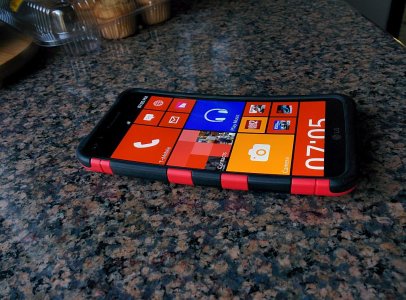
Think about why consumers are not considering Windows Phone to begin with. They go into a carrier store(AT&T, Verizon, T-Mobile, Orange, etc..) and see a Windows Phone display with a blown-up representation of the Start Screen. They immediately see a bunch of flat, square/rectangular tiles where it all just blends together in a mass of confusion and wasted space. In Windows Phone, the default is the square tile, so the first view you'll have is about 6-8 tiles visible at a time whereas in iPhone you'll see 20 icons and in Android perhaps even more at a time in their "app drawers". Remember this is a small display to begin with, so real-estate is prized. MS wasted it from the beginning with Live Tiles. Yeah you can say they helped to alleviate it with the smaller tiles, but that makes things even worse because small tiles are not live, and are even less discernible as to what they are. I think the Live Tiles are a huge UX failure for 95% of the people and it's reflected in market share.


