Windows 10 concept! What do you wanna see?

Brandon Tobias

New member
May 6, 2014
237
0
0
Visit site
Re: Windows 9 concept! What do you wanna see?

I think one thing shown in this mockup that Microsoft should heavily consider is the fact that the customization options can sometimes make Windows look ugly, thanks to poor design choices by the user.

Many people pick an ugly wallpaper and sometimes OEMs put ugly commercial wallpapers on, and the window color clashes and the transparency is not well done and sometimes used in the wrong places throughout Windows 8, which is clashing so much as it is with the fight between aero and metro.

What I like about this mockup is that the transparent aspects (if any in Windows 9) should have a desaturated dark background, or light background. I think OS X Yosemite does this well, and unfortunately it took Apple trying to pull off a Microsoft aero move, to show Microsoft what their transparency vision should have been in the first place.

That, combined with a nice wallpaper that's not too busy and not too plain with great color, really sells this design.

Clean, connected, efficient.

His concept is nice but i dont think windows should have transparent aspects other than the task bar. if it does it should be a flat transparent darkish colour.

the window for the explorer should be one flat colour no transparent aspects.... the cortana i dont like , the back and forward buttons are not modern like its too big but most of the UI was done right.

i like the task bar more than whats in windows now but ill take a stab at doing my own mockup ....

you are in the right track but what u need to do is think what would MS do for modern UI 2.0 and add a bit more flavor too it
 

Avik Biswas

New member
Jul 3, 2014
58
0
0
Visit site
Re: Windows 9 concept! What do you wanna see?

His concept is nice but i dont think windows should have transparent aspects other than the task bar. if it does it should be a flat transparent darkish colour.

the window for the explorer should be one flat colour no transparent aspects.... the cortana i dont like , the back and forward buttons are not modern like its too big but most of the UI was done right.

i like the task bar more than whats in windows now but ill take a stab at doing my own mockup ....

you are in the right track but what u need to do is think what would MS do for modern UI 2.0 and add a bit more flavor too it


well i like the transparent effect on windows and i am sure a lot of people would agree with me, but it can be optional, and leave it to user to decide.

aero is dead, it takes too much cpu power(or gpu), but for higher end hardware it should be optional. some people love it, and it is one of the reason people loved win7.

Explorer is fully flat (except the icon shadow). I love the shadow effects, see the apple's new design they are marvellous. Currently windows is too flat(see the wp), fonts are either too big or too small to read, accent color is a joke, and the start menu for win 8.1 is biggest flaw. This design represent what windows 8 should have been from the start, a desktop pc, no tablet. and also not fully flat not fully ugly 3d, but a beautiful blending of this two option.

as for cortana, i agree with you, it needs a complete makeover, but hey it is still in beta ;)

the back and forward button are taken from IE11, and it looks good, and yes the buttons are big for a reason, hope you know it by now (......touch).... and it does not look bad at all.

modern UI 2.0 and add a bit more flavor too it
what is modern ui 2.0???? flavour?? a new wallpaper should probably do the trick :)
 

Brandon Tobias

New member
May 6, 2014
237
0
0
Visit site
Re: Windows 9 concept! What do you wanna see?

well i like the transparent effect on windows and i am sure a lot of people would agree with me, but it can be optional, and leave it to user to decide.

aero is dead, it takes too much cpu power(or gpu), but for higher end hardware it should be optional. some people love it, and it is one of the reason people loved win7.

Explorer is fully flat (except the icon shadow). I love the shadow effects, see the apple's new design they are marvellous. Currently windows is too flat(see the wp), fonts are either too big or too small to read, accent color is a joke, and the start menu for win 8.1 is biggest flaw. This design represent what windows 8 should have been from the start, a desktop pc, no tablet. and also not fully flat not fully ugly 3d, but a beautiful blending of this two option.

as for cortana, i agree with you, it needs a complete makeover, but hey it is still in beta ;)

the back and forward button are taken from IE11, and it looks good, and yes the buttons are big for a reason, hope you know it by now (......touch).... and it does not look bad at all.

what is modern ui 2.0???? flavour?? a new wallpaper should probably do the trick :)

LOL the buttons are big for a reason yes but to me i just don't like it ..

MB__back.png
i would stick to this or some variation of it and apply your accent colour on it too keep with the design.

seems like MS is thinking along your train of thought ... i takes me a while to appreciate stuff so i keep coming back to your post to see what i like or whats grown and mostly u got it right as i said before.

What i like .
- Using accent colours in the explorer UI for the back / forward buttons and other elements is an excellent touch.
- The left side with favorite,s libraries and this computer yada yada is again well done wont change it in fact MS should just steal that as is.
- the drop shaddow effect is nice.
- The frame less window design i like as well
- I love your icons its flat, sticks to one colour with some hints of accent colours if needed MS should look into doing some icons like that.
- I like the counters for the apps the circle with the number in it. (i did this for my windows phone edit i think windows needs more accent circles as i like to call them.
- Xbox music i love one or two minor changes needed. *it should replace windows media player*
- The app switcher is cool.
- Start is cool but i think you have a better one up your sleeve.

What could change.
- I said your shadows are nice but too me too exaggerated. i like what Google has done with their shadows one flat colour transparent grey maybe you can do that along with a short fade at the end so its flat with a hint of chrome to keep the UI flat without being stale ???
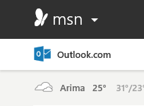
also the MSN preview site has it as well.
asa.png
on closer inspection its a fade but a very short one that looks kinda flat ....
- In the explorer windows you have videos with extra above it in blue it looks good but coming near to videos you added a gradient fade which is considered chrome. i would stick to the transparent blue colour with the solid dark blue dash above to give emphasis.
** if you insist on the fade i would have it less prominent I.E small faster fade.
- Minimize, Maximize and Close buttons i would have them colour less like what MS has in their most recent leak of Windows 9. Only when one hovers they get their accent color or red in the case of close.

buttons.png
buttons2.png

- I would have the stars for rating a yellow orange colour.
- xbox music i would move the media scrubber bar above the controls bar, play rewind and forward should be the windows standard icons enclosed in circles that looks appealing to me idk why and last the scrubber bar is too bright a green in my eyes but that's not an issue.
- i really wanna like the control panel but sumthing about it screams no to me i rather the PC settings MS has if they added all control panel stuff and maybe some flat colourful icons like what you designed. but your design is well executed.
- rework the file or explorer icon.

What i miss.
- The blue highlight on file on the extreme left.
- differentiation of the search / file path bar.

what i want you to consider.

in the leaked images and videos we see two need flat icons next to start search and the new scene (multidesktop mode) icon ...
my train of though if MS put search there i'm thinking it can be ripped out of explorer completely so if i'm in an explorer window it would search inside of the window in that location. but if i have no windows open it would open up a general search UI that pools local content, online results and stuff from within your / a companies network / intranet. just a thought like context aware search.

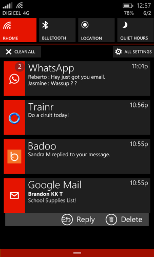
i would like to see your take on MS notification center. (im thinking a bit of notification tiles / cards like what i did with WP see image).
mod2.3.png

overall MS could learn from you and this dude kgbstyle (phyek) on deviantART.
 

Avik Biswas

New member
Jul 3, 2014
58
0
0
Visit site
Re: Windows 9 concept! What do you wanna see?

That notification centre is awesome, love your design. Would love to see some more design from you :)

overall MS could learn from you and this dude kgbstyle (phyek) on deviantART.

That is some incredible design, but it reminds me of apples new Yosemite design.

- I said your shadows are nice but too me too exaggerated. i like what Google has done with their shadows one flat colour transparent grey maybe you can do that along with a short fade at the end so its flat with a hint of chrome to keep the UI flat without being stale ???

actually the shadow concept is taken from apple, as they look really nice, I have tried other kind of shadows in variant wallpaper and colors, but this one is the best so far, add a lots of depth, rather than being flat, like in win8.1

i love kgbstyle's design, especially the focused window has opacity 1 while other has less opacity.but i assume that use too much cpu power.

In the explorer windows you have videos with extra above it in blue it looks good but coming near to videos you added a gradient fade which is considered chrome. i would stick to the transparent blue colour with the solid dark blue dash above to give emphasis.

well my design represents chrome + flat, i hate too much flat.

- Minimize, Maximize and Close buttons i would have them colour less like what MS has in their most recent leak of Windows 9. Only when one hovers they get their accent color or red in the case of close.

that depends on user choice.

- xbox music i would move the media scrubber bar above the controls bar, play rewind and forward should be the windows standard icons enclosed in circles that looks appealing to me idk why and last the scrubber bar is too bright a green in my eyes but that's not an issue.

i have a new design almost ready, will post soon.

rework the file or explorer icon.

i didn't make those icons, they are from Modern UI Icons, Thanks to Austin Andrews. if anyone can give me better icons, iwould love to.

The blue highlight on file on the extreme left.
- differentiation of the search / file path bar.

This design choice is well thought, and don't worry you will get used to it.

in the leaked images and videos we see two need flat icons next to start search and the new scene (multidesktop mode) icon ...
my train of though if MS put search there i'm thinking it can be ripped out of explorer completely so if i'm in an explorer window it would search inside of the window in that location. but if i have no windows open it would open up a general search UI that pools local content, online results and stuff from within your / a companies network / intranet. just a thought like context aware search.

well, still not much info is leaked, waiting for more info :)

Overall this design is need a little tweak, i am currently working on few design, like, new start menu with notification centre integrated. and others. But overall, design aspect varies from user to user. This design is more windows like, no mac, android, or others, I strongly feel that this design can be improved a lot and make it more unique.

I might also post the PSD files, so that others can also improve it. But no plan yet.
 

Brandon Tobias

New member
May 6, 2014
237
0
0
Visit site
Re: Windows 9 concept! What do you wanna see?

That notification centre is awesome, love your design. Would love to see some more design from you :)


That is some incredible design, but it reminds me of apples new Yosemite design.


actually the shadow concept is taken from apple, as they look really nice, I have tried other kind of shadows in variant wallpaper and colors, but this one is the best so far, add a lots of depth, rather than being flat, like in win8.1

i love kgbstyle's design, especially the focused window has opacity 1 while other has less opacity.but i assume that use too much cpu power.


well my design represents chrome + flat, i hate too much flat.


that depends on user choice.


i have a new design almost ready, will post soon.


i didn't make those icons, they are from Modern UI Icons, Thanks to Austin Andrews. if anyone can give me better icons, iwould love to.


This design choice is well thought, and don't worry you will get used to it.


well, still not much info is leaked, waiting for more info :)

Overall this design is need a little tweak, i am currently working on few design, like, new start menu with notification centre integrated. and others. But overall, design aspect varies from user to user. This design is more windows like, no mac, android, or others, I strongly feel that this design can be improved a lot and make it more unique.

I might also post the PSD files, so that others can also improve it. But no plan yet.

video Windows 9: Startmen? geht auch ganz ohne Live Tiles - YouTube

i can play with the PSD files if u like
 
Last edited:

Brandon Tobias

New member
May 6, 2014
237
0
0
Visit site
Re: Windows 9 concept! What do you wanna see?

http://forums.windowscentral.com/bbm-windows-phone/298440-bbm-ui-enhancements-changes.html

one of my designs ^^^

multi  1.png
multi 2.pngmulti 3.png
multi.pngnav.png
nav2.pngRecorder2.png
sett.jpgshare.png


designs
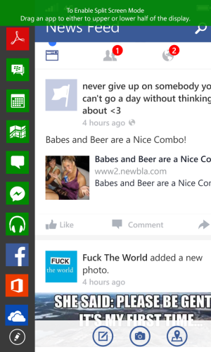
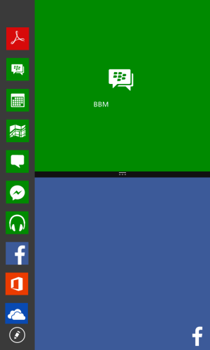
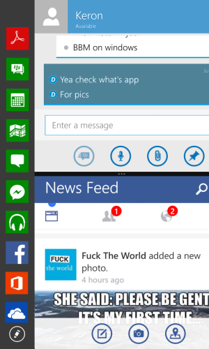
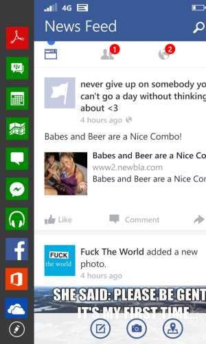
- Snap view 2 apps at once
- Customizable nav bar can flip the back and search buttons ( i was thinking adding a camera shortcut to the extreme right hand side which the user can change for a flashlight toggle or anything really.)
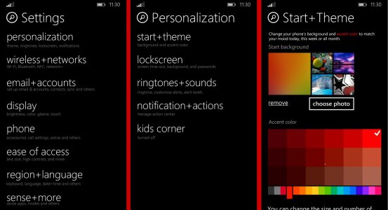
- Settings redone
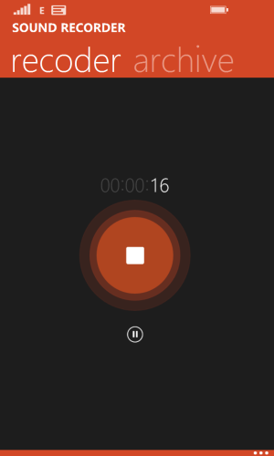
- Recoder app (needs to redo .)
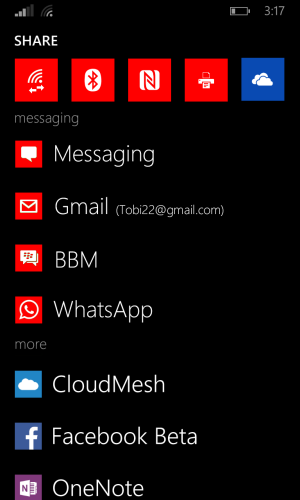
- new Share screen .. has quick buttons on top for most used sharing mediums in my view (wireless and one drive) then it groups off apps into messaging, social and just other apps.
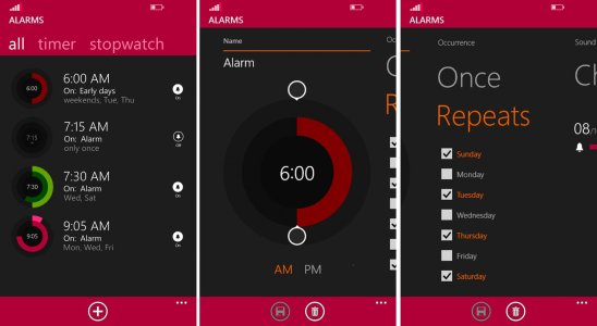
- alarms revisited

alarm.jpg

thats all i played with so far i think WP needs a complete overhaul ..
 

Avik Biswas

New member
Jul 3, 2014
58
0
0
Visit site
Re: Windows 9 concept! What do you wanna see?

Wow, nice design, specially the alarm, it is really good.

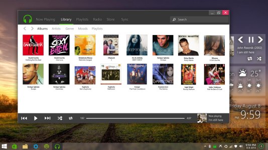
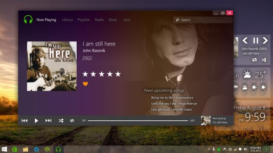
so here is my new xbox music concept update.

windows concept music library.jpg
windows concept music.jpg

There is still some rough edges, need a bit more polish.
 

Brandon Tobias

New member
May 6, 2014
237
0
0
Visit site
Re: Windows 9 concept! What do you wanna see?

Wow, nice design, specially the alarm, it is really good.

so here is my new xbox music concept update.

View attachment 80863
View attachment 80864

There is still some rough edges, need a bit more polish.

nice but put the scrubber above the grey bar to give it a bit of a visual breakup. but nice Xbox music meets Windows media player awesome and Flat lol
 

RajeevT

New member
May 3, 2014
319
0
0
Visit site
Re: Windows 9 concept! What do you wanna see?

nice but put the scrubber above the grey bar to give it a bit of a visual breakup.
Since I generally hold my tablets towards the bottom (left/right corners nestled in the palms of my hands), the scrubber at the bottom would be much easier to reach using just my thumbs (with the app maximized, which is how I like it). What do you think?
 
Last edited:

Avik Biswas

New member
Jul 3, 2014
58
0
0
Visit site
Re: Windows 9 concept! What do you wanna see?

well, scrubber at the bottom or top, it is a debate, I think the middle position is suitable for everything, at the bottom, i have no idea how user can interact with it! so is the top!

This design is nice, need a bit more polish, any other suggestion would be nice :p, let the scrubber stay where it is :)
 

Brandon Tobias

New member
May 6, 2014
237
0
0
Visit site
Re: Windows 9 concept! What do you wanna see?

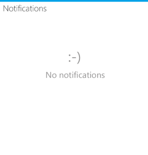
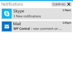
Windows Notification center redone from the video mines is better MS
0.0 no notifications have a small smile.
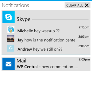
1) so multiples messages under the same app aggregates aka they collapse if they go beyond 2 eg with skype 3 messages makes it collapse into a a small tile.
2) clear all not sure if it looks better with the box or not.
3) when you tap on an app with aggregated messages the tile expands (Skype app) showing all messages which can now be flicked(swiped) away or if the cursor is on it will show an X where the time is.
4) if i click on a message or notification in expanded view under an app it takes me to that direct message or notification.
5) screen shots will be shown here.
6) print and other short lived events will also show up here.
7) windows updates will show up here as well as app updates.

notification.png

notification1.png

notification2.png

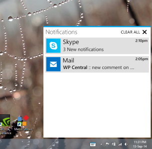
in windows view
noti.png
 

Avik Biswas

New member
Jul 3, 2014
58
0
0
Visit site
Re: Windows 9 concept! What do you wanna see?

i was actually thinking about this same idea, i wish MSFT actually copy this, as it would be really awfull if you have 100+ skype notification, and you have to scroll all the way to bottom to see other notifications, great job!

BTW i think you should use a bit small font, as it is specially for desktop, and desktop user hate big fonts. I will probably copy and paste this design! :)
 

Avik Biswas

New member
Jul 3, 2014
58
0
0
Visit site
Re: Windows 9 concept! What do you wanna see?

i was wondering, if msft brings notification center, what about action center!! thats completely useless now.

80885d1410666311-notification.png


This kinda looks like google+ notification center.
 

Brandon Tobias

New member
May 6, 2014
237
0
0
Visit site
Re: Windows 9 concept! What do you wanna see?

i was actually thinking about this same idea, i wish MSFT actually copy this, as it would be really awfull if you have 100+ skype notification, and you have to scroll all the way to bottom to see other notifications, great job!

BTW i think you should use a bit small font, as it is specially for desktop, and desktop user hate big fonts. I will probably copy and paste this design! :)

lol i like the bigger font its smaller than the font used in the flags that windows 8 uses on the top right hand corner of the screen for notifications like email.

it kinds does look like G+ notifications but more MS like just tried my hand at it lol
 

Brandon Tobias

New member
May 6, 2014
237
0
0
Visit site

aerosidinc

New member
Jul 25, 2013
53
0
0
Visit site
Re: Windows 9 concept! What do you wanna see?

like Cortana design and hope to see notification center will be implemented in the same way. One more thing, modern apps icon in taskbar look better this way than of current implantation(with tile layer as a background)
 

Members online

Forum statistics

Threads
327,117
Messages
2,249,402
Members
428,636
Latest member
Felipeasstewart