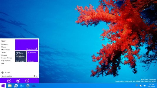
Threshold transparency concept

BrandonTeoh

New member
Oct 31, 2012
57
0
0
Visit site
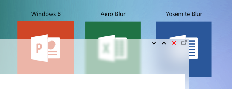
I started to working on a new concept art for Windows 9/Threshold. One of the concept art is on the desktop and I being thinking how the window would behave if Microsoft dare to put transparency back.
Blur concept (Desktop).png

I was thinking 3 (actually 4) how would Microsoft implement metro on the desktop. One is just the normal Windows 8/8.1 opaque style. The second one is the Windows 8 taskbar transparency, the third one is the return of the aero glass, the last one is OS X Yosemite style blur.

Do you have any comments?
 

BrandonTeoh

New member
Oct 31, 2012
57
0
0
Visit site
Highly unlikely with Microsoft keep pushing flat style, its too late to go back :p

Anyway, any thoughts if Microsoft decided to put Yosemite type blur to Windows?
 

anon(7900571)

New member
Aug 5, 2013
8,034
0
0
Visit site
Highly unlikely with Microsoft keep pushing flat style, its too late to go back :p

Anyway, any thoughts if Microsoft decided to put Yosemite type blur to Windows?

they do have that in windows vista and windows 7 , namely aero glass interface. But they removed this in windows 8(but its still present in taskbar though). I don't think so they have any plans becacse aero glass was a resource hog. I mean it requires CPU/GPU power which resulted in slow down on older machines. Yosemite effects looks like iOS 7 flat UI(Yes they are :p )
 

BrandonTeoh

New member
Oct 31, 2012
57
0
0
Visit site
Maybe continue to stick to opaque style? Windows 8 taskbar transparency just plain weird already on the taskbar. Yosemite blur will invite Apple for another lawsuit.
 

anon(7900571)

New member
Aug 5, 2013
8,034
0
0
Visit site
Maybe continue to stick to opaque style? Windows 8 taskbar transparency just plain weird already on the taskbar. Yosemite blur will invite Apple for another lawsuit.

haha I will what new UI changes will next iteration of windows will bring. One thing is confirmed, New(or old windows 7 style) start screen :wink:
 

BrandonTeoh

New member
Oct 31, 2012
57
0
0
Visit site
Yeah that, to be honest, I am surprised they are bringing live tiles to the Start Menu.
Desktop Start Menu.jpg

That picture above was an older Windows 9/8.2/Threshold concept.
 

DustinRyan

New member
Nov 11, 2013
236
0
0
Visit site
I definitely think Yosemite transparency is best. It's the kind of transparency I was hoping for in Windows for years. And of course now Apple went and did it before Microsoft. It's cleaner. Less layers upon layers of windows adding so many borders and lines, but still gives the visual that there's layers of content without being too busy looking.

I think the current transparency on the Windows 8 taskbar makes no sense, when the rest of the OS doesn't use it. Not to mention the metro and aero looks completely clash. It needs to be uniform throughout.

If transparency stays, it should be done like Yosemite, in my opinion.
 

Chemilinski

New member
Jan 15, 2013
55
0
0
Visit site
You mean "translucent", not "transparent".

Anyway, the blurred effect as stated above by Himanshu is a resource hog. Apple can do it because all their machines have decent specs, but Windows is made for everyone and so needs to run smoothly for everyone on the lowest spec'ed machines.

Moreover, personally I feel the effect adds nothing. It may look pretty but so did Vista a first, and then I realised it was just a gimmick. It's pretending to be glass and isn't authentically digital, which is against what Modern UI is about.
 

Members online

Forum statistics

Threads
323,236
Messages
2,243,501
Members
428,049
Latest member
Nathanboro12