When I first moved to android, I initially used the Microsoft Launcher. But a couple weeks ago, like
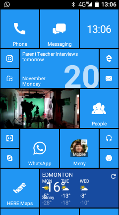
@dlchome, I now use Squarehome 2. It doesn't have all the functionality of REAL live tiles, but I don't think any launcher can fully duplicate the beautiful Live Tiles of Winbdows. But Squarehome 2 sure makes the phone FEEL and look more familiar. Because honestly, icons look so ARCHAIC to me now, like I'm computing like a cave man.
Also, if you combine Squarehome 2 with the Whicons Icon pack, you can get a beautiful, flat interface that looks so familiar to use WP guys.
This is what my Android home screen looks like:

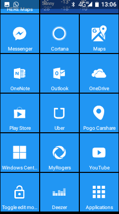
And, just like Windows Phone, the home screen scrolls vertically, so you can have a ton of tiles that you scroll vertically through. This is my next page of tiles below:

in addition, Squarehome 2 paid lets you set a whole bunch of gestures, of which I used in order to swipe from right to left to get the app list, just like on Windows Phone.
It does allow you to set tap and long tap actions for each tile too, so you can actually have two different actions for each tile. For example, I have a tile for my wife. One tap launches an SMS message to her, a long tap directly dials her. For WhatsApp, I have one tap launch directly into my most busy chatroom, and a long tap opens the app to the default main screen.
This has made Android bearable. Because honestly, I find there is absolutely nothing interesting or inspiring about the OS. It functions, but that's about it. Boring as hell. Widgets are fugly with no consistency in design, typography, or readability. Customization is it's saving grace.
The Microsoft Launcher isn't bad, I just found it hardly does anything different than stock android.


 a WM can - brilliant. Great partner to my X3 etc. Stuff Android and the fake WM shell
  . My wife is getting the iPhone X, but will still keep and loves her 950xl. She feels sad and doesn't understand (not having my tech knowledge or interest) why WM wasn't continued.