- Aug 25, 2015
- 20
- 0
- 0
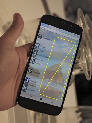
In Windows 10 Mobile, there is a lot of wasted space in 'All Applications' list which looks Awful. But there is no one discussing about that. So is it only me who thinks that there is a lot of blank wasted space here and it's ugly?

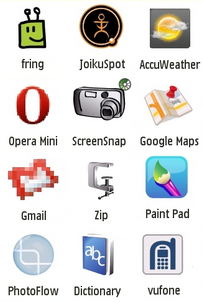
Edit- How about SIMILAR grid like approach with a difference that apps are separated alphabetically. We get better visibile flat icons then.


Edit- How about SIMILAR grid like approach with a difference that apps are separated alphabetically. We get better visibile flat icons then.

Last edited:

