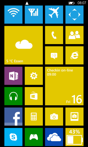
Gap at the top between the network, battery and the first row of panels

gav_sw20

New member
Nov 13, 2012
16
0
0
Do we know if the next s/w release will address the gap at the top of the screen ?

I find it a bit annoying that its there and only allows you to see half of whats on row #7 on the screen, yet if you scroll up ( or is it down) and go up to the top of the screen (is where the battery, network is) you can see all of row #7.
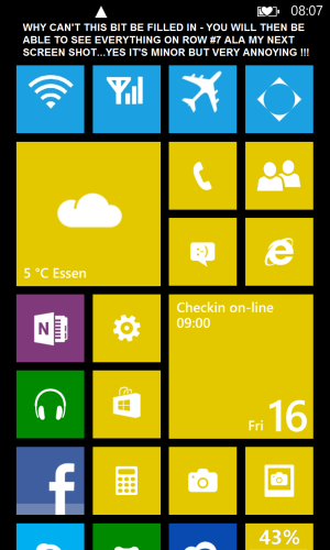
wp_ss_20121116_0002.png

This is what it should be like: -

wp_ss_20121116_0001.png
 
I would imagine the reason it exists is this:
If you get a toast notification and all your icons on the top row are exactly how you have yours in the picture you wouln't be able to click any of them until the notification went away which would actually be pretty annoying IMO.
 
I would imagine the reason it exists is this:
If you get a toast notification and all your icons on the top row are exactly how you have yours in the picture you wouln't be able to click any of them until the notification went away which would actually be pretty annoying IMO.

True, but unless they've changed it in WP8 (still waiting my pre-order from 17 days ago!!) you don't have to wait for notifications to disappear. Slide them to the right if you want to get rid of them.
 
I was thinking the same thing. The toast notifications fit perfectly in that space so that is what it must be for but like you said we could always just slide them away.
 
Yeah but not everyone (And I suspect not even a majority) of users would even know that so that's why there is always more then one way of doing things :-p
 
Honestly, if this is your only gripe or problem with the phone/OS, count your lucky stars. There are a handful of things I would rather see changed before this, though I do agree there is little logical reason for the gap (however I didn't really noticed until now).
 
yea this gap is a waste of screen space and should be removed. it would also give the impression that the screen is bigger
 
Agree re toast notifications but when you are browsing using IE the screen uses this space at the top of the screen and the toast notifications still display correctly.
 
Yes, and the left and right margins as well as the gaps between tiles should be eliminated to make even more room for tiles.</snark>

The thinking behind that screen (and all user experience design) is a compromise among aesthetics, usability, efficiency, discoverability and consistency with the rest of the platform. Just jamming more icons on the screen at one time might help the efficiency goal (quick access to more stuff), but may have tested badly with "normal" people (users who aren't coming from a background of flashing ROMs and tweaking UIs to fit their personal wishes).
 
I must agree with the OP. I'd like to see the gap removed. I can deal with the notifications overlapping the top row of titles.
 
Since we're talking about gaps, what about the gap on the left AND right sides of the screen? I am sure htere is a reason the screen doesn't extend edge to edge.
 
I like the gap. It makes for a clean, uncluttered home screen. I found my Android phone to be too cluttered when it seems every app has something to put up there. There are tiles for most functions if there are important status's you need to see.
 
It's called "negative space" and it was an even bigger design element in WP7's home screen. Us WP7 fans had to deal with a blank "gutter" space on the entire right-hand side of the screen which was never utilized at all. There was also a space on the top just like WP8 has now. I never liked the gutter space, but there were plenty of WP7 fans that were not happy to see it go. I much prefer WP8's design, and the negative space at the top I don't mind.
 
Maybe they could design the OS to push the tiles down when a toast notification pops up.
 
Gap are good. Go see /r/gaps ;)

On a serious note, this is same as gutter story and will eventually be removed.
 
It's actually intentional design to push row 7 down below the fold, by having row 7 partially off the screen it's clear that you can scroll down. I think they could have made the top gap maybe 1/3 smaller, but to convey the ability to scroll half of row 7 should be hidden. Though oddly, almost everyone I hand my phone two initially swipes right and is confused by the app list, due to their ios/android habits. It's the same way people started mashing the screen on my non-touch kindle after the ipad came out.
 

Members online

No members online now.

Forum statistics

Threads
334,355
Messages
2,257,331
Members
428,725
Latest member
Billybob