Why cant we have our cake and eat it to. Everyone
seems to be arguing over functionality vs. os aesthetics. Sure the old FB application is more Metro in design, and sure the Beta app is more functional and cross platform, but there is always a middle ground. Example:
View attachment 33188 View attachment 33189
View attachment 33190 View attachment 33191
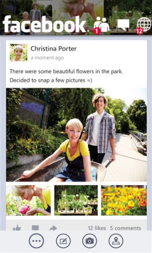
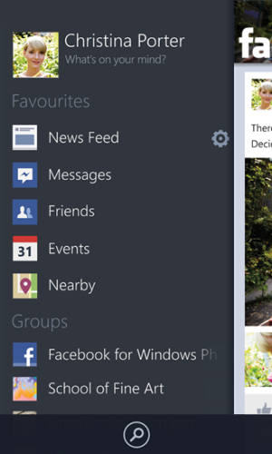
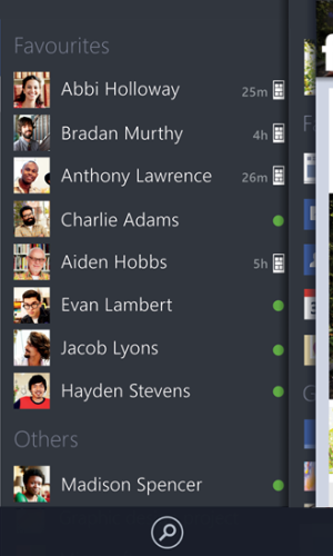
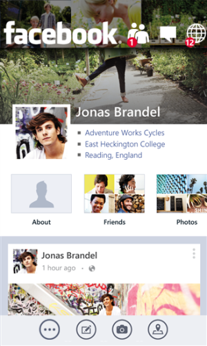
In these images I have made, I modified the screenshots for FB Beta. As you see, the image banner in this theoretical design would take up no less space then the fb beta top menu bar (and status bar), and would have the notification icons overlaid upon it. Also, the menu button would be in the MENU bar for the sake of os design. Second, pressing the menu button would cause the facebook menu to appear (with a thin shadow from the feed page, indicating its underneath the page you were on, giving it slight depth). The same would be for the friends button (previously within the top bar in FB Beta), being laid underneath the main menu.
This concept design would give off
an appearance of metro (with its single menu bar and the old FB image banner w/ Metro stylized icons) as well as make it unique to the OS, while still giving it a cross platform feel and ease of use.
My point with all of this is there is always middle ground. I feel people AND developers either misunderstand and over utilize the OS design scheme (old FB app) or they throw out most of the os design altogether for usability and familiarity(FB Beta, which no, it is not Metro. just because you flatten it out, and use Segoe UI/WP, does not make it metro). People need to be
Creative in utilizing the OS design scheme while still giving it functionality (&/or familiarity). Sort of a yin and yang of functionality and aesthetics.
Sadly, I doubt Microsoft will ever read this.


