So i woke up this morning and saw that Daniel posted about this thread on the home page of this website. I read the article he wrote and to me it feels like he didn't read beyond the first page of comments in this thread. For some reason he thought that i have "an axe to grind" with MS. So let me clarify exactly what i am trying to say through this thread.
1. I dont hate MS. As many of you might think, i dont hate MS. In fact i love it so much that i wish i could work there even if it was for free. I am a huge fan of MS. All my devices (phones, laptops and PCs) are running MS products and i do everything through the MS eco-system. Every device in my house has MS OS on it, my parents' phones are lumias, my sister's phone is a lumia and my phone is a lumia.
2. Criticizing MS is not hatred. The only reason i put this thread was because i care too much for this platform and for the eco-system in general that i dont want to see the other reviewers slam MS for the UI/UX issue. I mean after all, this is better come from me and now rather than from android/iOS bias reviewers later after RTM.
3. UI/UX is not everything in an OS but it is the first thing a user will see, feel and interact with. When a new potential user looks at a phone, he will notice how the phone looks like and how the UI is. That is why i was saying that the UI forms the user's first impression of the OS which is why it is very important to take care (alot of care) of this component of the OS before it hits RTM.
4. Criticism is NOT complaining, whining or .... (insert other similar words). When someone criticizes something or someone, it is not hate/dislike as many might think, in fact, most of the time that person cares for that thing/someone that he is trying to get them to do better. So i am not hating on MS, but i am trying to do my part as a fan, developer, insider and user in helping them shape this platform.
5. Alot of people who commented on this thread use the WaaS (Windows as a Service) as an excuse for MS to release in-complete, feature missing OS to the masses. Yes, no software is perfect, all softwares have bugs and they all receive updates to fix those bugs later during its lifetime. But if you think about it, WaaS is just a fancy term by MS, put together in order to prevent people from saying that this is bad, or this is missing because then they can simply answer: "well, windows now is a service, so soon(tm) you will get an update to do this". If updates to a software are considered services then that means android is also a service, so is iOS too because they all release periodic updates. WaaS is not an excuse for MS to release a system to millions of users and when they report (not complain) about issues, MS tells them to wait for updates that are coming soon.
6. Never in this thread have i "complained" of performance issues. Being a software developer myself, i know how an ALPHA/BETA stage software performs. Main point of this thread was the UI/UX issues and inconsistencies throughout the OS and MS's first party apps. Basically every UI in the OS is following its own rules and design guidelines. This is what i am trying to get to here.
So i read the article and started reading through the comments on it. I noticed many people who agreed with me and many who didnt. and i respect both sides, after all we are MS fans here and we are all human beings entitled to our own opinions and believes. But then someone like this guy comes along and ruins it for everyone:

I also learned that criticizing how this site works or its priorities will get me a private message from a moderator warning me not to change the subject of the thread.... thanks for that.
Oh, and to those who said that my argument about the gray colors in the OS is just bad. If you have read anything about design aesthetics, you will know that colors in a design are used to convey emotions in a design. Bright colors bring joy and happy feelings to users and colors like gray represent sadness. So colors are like a powerful weapon in the hands of the designer and can make or break a design. That is why i was saying gray is a bad choice.
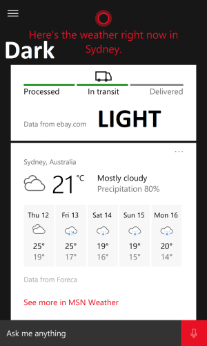
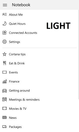
Look at MS ads for windows 10 mobile or any WP devices. The focus on 2 things: UI (Start Screen) and Cortana and what it can do. They make a big deal of cortana and how awesome it is and all its great features (I too think Cortana is absolutely great and epic). Now all that in the ads, so when a user is looking for a new phone and decided to take a look at W10M they will notice the beautiful UI and then they will go into Cortana in the current version (which i think is an abomination and an insult to everyone who used Cortana in WP8.1) here is what they will see:
(Phone is using dark color)


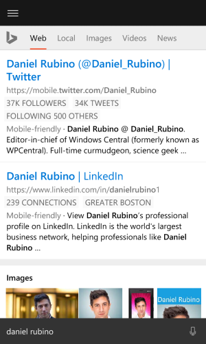
And then comes the biggest abomination and insult (I am talking about the bing mobile website wrapper and not Daniel Rubino LOL):

Tell me again please, how do u consider an OS with such a mess in one of the most important components, its shell, READY?


