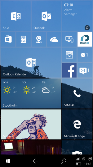
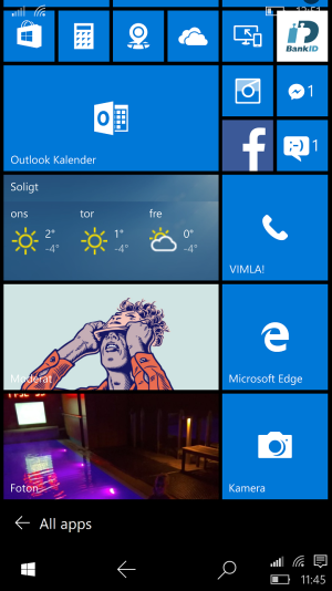
I've thought of this concept for some time of a navigation bar and system tray in Windows 10 Mobile that looks like the navigation bar and system tray in Windows 10 in tablet mode. This would make WiFi and cell status, notifications, battery and time visibile at all times compared to today, without sacrificing any screen real estate.
Swiping to the left on the Start Screen or pressing the notification icon in the system tray anywhere would bring up the Action center on the right, also just like Windows 10.
In addition to this, the "All apps" section would be located to the left of the start screen instead of to the right as it is today and therefore accessed by swiping to the right.
In this way, the whole navigation bar, system tray, start screen/menu, action center and all apps menu would basically be similar to Windows 10. You can download the picture to your Windows 10 Mobile device and try it.
 . .
. . 
Swiping to the left on the Start Screen or pressing the notification icon in the system tray anywhere would bring up the Action center on the right, also just like Windows 10.
In addition to this, the "All apps" section would be located to the left of the start screen instead of to the right as it is today and therefore accessed by swiping to the right.
In this way, the whole navigation bar, system tray, start screen/menu, action center and all apps menu would basically be similar to Windows 10. You can download the picture to your Windows 10 Mobile device and try it.
 . .
. . 

