My New Action Center concept!

Jan Marcelo

New member
Apr 7, 2014
27
0
0
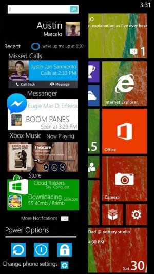
My new action center! Hope you like it guys
By the way,It works when sliding left when you're at start screen!
asdasdaksdasdasdas.jpg

Updated!
-Makes the notifications to fit on the black background thingy and fixed the search.
-Change the power options color to the color scheme of the phone.
-Removed Date and Time at the Action Center
-Added More Notifications so you will see the other notifications just like the text we have on the start screen, just swipe it down to see more.
-Removed the battery percent and icon
 
Last edited:
I'd have to agree with WavingReds. Cool concept but it makes a very cluttered screen. This would also require extra programming for each app where as the current model builds around an already existing notification backbone.
 
I will try to make a video :) of these feature so you can really understand how it works! :wink:
 
I like it, but you need to get rid of the start screen (so your concept needs to take over the while screen), and you do need better spacing and empty space.
 
Yeah, I'll try to do more minimalistic concept. You have good idea, but I wanna show "my vision" of it.
 
The concept of swiping inward from the left edge is fine (actually prefer it to what we got in 8.1) but the icons and other elements are cluttered and don't follow WP's clean UI. You should try to make a version which follows MS' design principals.
 
The common issue with people doing redesign concepts is that they do not account for usability issues. These concepts are most often conjured up in their imagination and put together digitally on a computer. The problem with that is that no one ever encounters problems that would be apparent when you use it day to day. In this case, how would anyone be able to tap on "call back," "message," or any of the Xbox Music transport controls. They are at most half the size of the smallest start screen tile. I'm already doubting that this would be a joy to use on a Lumia 920/925 let alone a 520.

Also, you have icons that are custom shapes for Facebook Messenger and Store. Where are these icons supposed to come from? The current tiles are all square/rectangular so every app needs to be updated to include a different convention of icons just for the action center? The search bar looks like it came from Windows. Windows Phone and Windows have similar design language but they are not the same. Also, Windows Phone rarely, if ever, use square iconic buttons as seen in your power options section unless they have text as part of the button content. Think AppBar buttons vs Action Center toggles.

This honestly looks like some kind of skin for Android and the core of Windows Phone's Modern-UX design language is mostly lost in this concept.
 
Also swiping from the left is used all over in the us to use pivot controls. opening the action center everytime by accident would be very annoying.
 
Like what your doing with your action centre . but could you do a action centre with text only. You'll find people preferences here, that less is more.
 
Gonna come straight out. Its not nice, it needs a 'modern' feel to it the stuff seems to be disorganized ugly.
 
This concept unfortunately would not work on a phone less than a packet, it would be too small for only the ⅓ screen. Also sweeping right wouldn't work in all apps.(Internet Explorer), so this is a good idea if you make it swipe down and take up full screen.
 
I'm going to have to agree with the others, I like the way it is now, simple and basic but, the information that you want is easily accessible. It looks too busy.

Kind of like the new tile layout, I had a picture of my kids playing in the house in the background of my tiles, I showed it to a few people and they said it looked too busy....and I can see where they are coming from. This concept reminds me of that.
 

Members online

No members online now.

Forum statistics

Threads
334,071
Messages
2,257,040
Members
428,720
Latest member
pooja s