sheharyarali
New member
- Nov 8, 2012
- 28
- 0
- 0
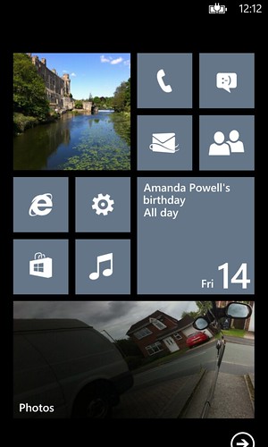
Putting up a new one today - decided to remove some seldom used apps and go with a "two home screen" approach. For anyone interested in copying this idea - there is a small black tile in between the two "home screens" to separate them. So when you unlock the screen, the top set of tiles are the only thing you see, and one flick up gets you the whole "second screen" in one view. I put my most used apps (used every 3 days or so) in the top screen and tried to make the tiles stay the same consistent color for visual appeal. The bottom screen is apps used at least once a week and I tried to have the top two rows be work/news and the bottom two rows be media.
View attachment 24260
how did you get the small black tile?
Find Wiztiles in marketplace. Great appHey folks,
Quick question. How does one go about getting the text on their dividers to show up like in the attached example?
Thanks in advance.
Kult. I assume you have a yellow phone?
Awesome looking bathingsuit-picture on your Contacts display there. And your Gold has a very noisy picture!
I like the screen organizing


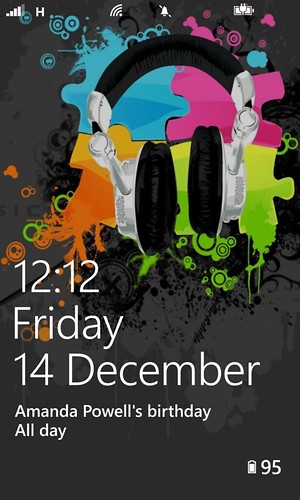
Here are my screens for it..Seeing the ones posted here already makes me wanna get more creative lol
View attachment 24849
View attachment 24850
what is that star in the middle?

