willybraatlund
New member
- Oct 18, 2012
- 271
- 0
- 0
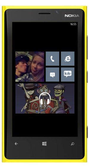
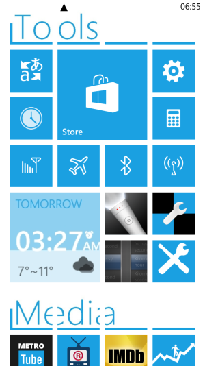
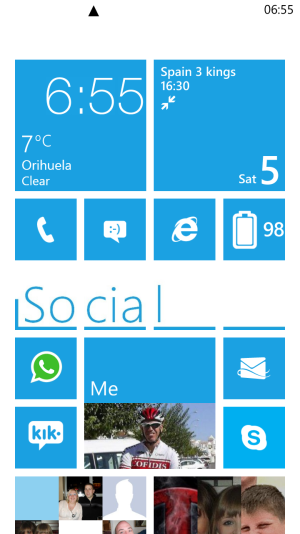
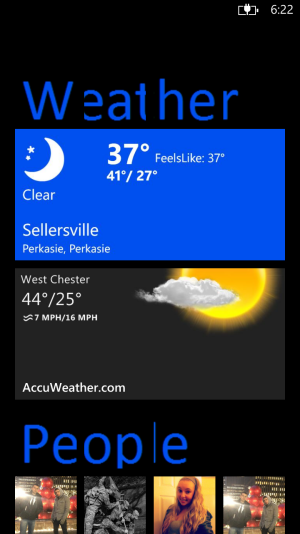
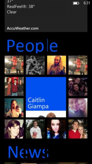
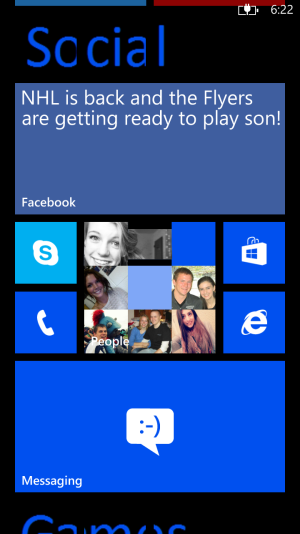
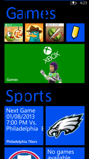
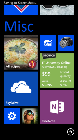
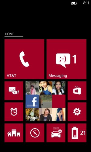
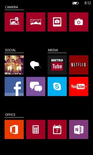
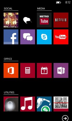
Like most of the WP user, I constantly keep changing my home screen. And I finally figured out, for me, that having less on my screen is better. Have a clean and nice look. But then I noticed that I needed to have quick access to a few more apps. So I divided my screen into too sections. Just with one swipe you go from bottom to top, with nothing in between. And I add some black tiles as spacers so that my first screen was more centered and looks like the picture to the right

