Can you tell me which calender app you used? Looks awesome.
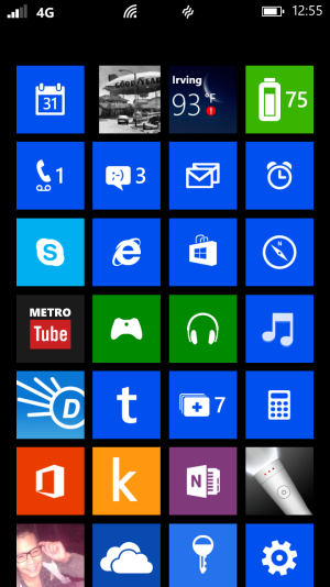
The calendar app is called Simple Calendar
Can you tell me which calender app you used? Looks awesome.
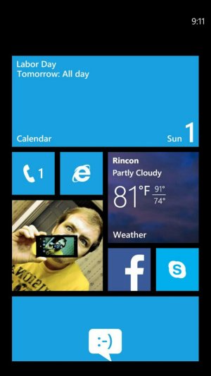
I totally agree. The idea is that the seventh row, if you know what I mean, is deliberately only half visible, to show the user that there is more content that can be scrolled down to. But if it were me, I'd lose that idea. The user knows what's on their own phone. Make 7 rows fit nicely, because they do fit. I'd also make an option to hide the clock, so that it only appears when you tap the top of the screen, like the other elements.View attachment 41578View attachment 41579
Wouldn't it be great if the tiles naturally started right under the clock...
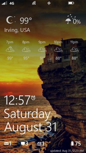
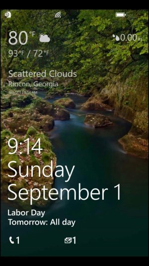
I did it the wallpaper myself. The weather info on the lock screen is from the weather app, The Forecast; in the notification area, LockTemp. I actually made 4 different wallpapers, one for rain, sun, night, overcast. I change it myself if I'm bored, but it tends to stay on overcast. I would love to find a weather app that did that automatically with this look. The Amazing Weather HD lockscreen has a similar option, with the weather image being separated from the bottom, you might check it out.
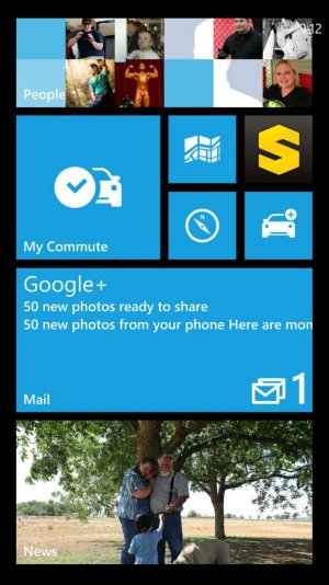
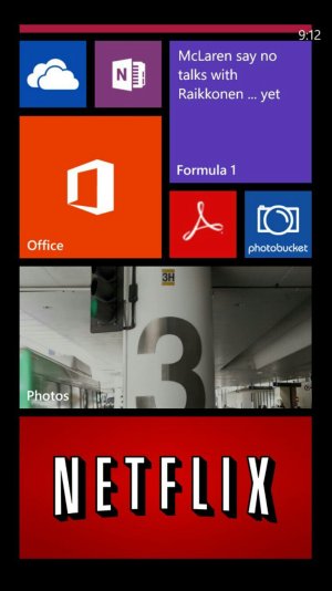
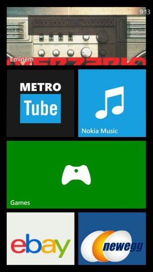
Here?s mine after I got the Amber update
I think WeatherFlow can set wallpapers based on current conditions. But not custom ones AFAIK...
What calendar app is that in the small pic
thanks
What calendar app is that in the small pic
thanks
great idea with the photo studio! :shocked: and in case it's supposed to represent Your real phone, did You buy it gray or changed shells? Might do it as well, can't stop thinking about gray...
Thanks
fortunately I live in Germany where you can get all colors - even without contract!
So, yes it represents my phone and I love how it matches the color of the moon
