serfedinand
New member
- Jul 26, 2014
- 4
- 0
- 0


")
Thanks! Shame its not working well with transparent tiles. Would be cool if Msft bring "groups" to W10M start screen too! I love it in W10! ^^Yes, thats it")
Okay, I reedited it. Now it looks a bit nicer, I think.
View attachment 120431
EDIT
Well ^that didn't last long.
View attachment 120434
Well ^THAT didn't last long either. Apparently I don't like making decisions, lol.
View attachment 120444
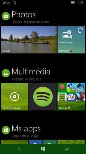
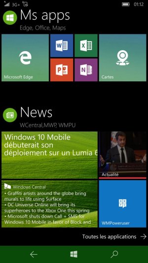
 Very clever use for #Tileart! ^^


![wp_ss_20160116_0001[2].png](https://windowscentral-data.community.forum/attachments/86/86558-0a1d043f21eacb307a17134c709dbfa9.jpg?hash=Ch0EPyHqyz)
 Twitter