WP8 Ugly tiles

jabtano

New member
Nov 25, 2010
613
0
0
I like WP8 much, the idea of just having that fast glance of info that one can have on a tile, WP Developers have done a fantastic job of that. Yet Microsoft hasn't the stock IM..EMAIL..SETTINGS tiles are out right boring and ugly. you would think they would at lest give us the option of changing them..ok just a tile rant...
 
Yes, they are. I hate that they follow the accent color. Why do I have to have lots of basic tiles with the same color? It makes them hard to distinguish at first sight, and the phone looks boring.

We should be able to pick the color, or Ms should set standard tiles that are different between each other.

Yes, I know I can change them with custom soft, but those tiles sometimes lack functions, or take a background task spot.

I wonder if there is a consumer request at Microsoft's feedback site about this. I'm tired of creating them :p
 
Glad I'm not alone I've tried a few custom tile changers but say the IM tile still has that dam square in the middle of the or a smile face.
 
I wish more developers would make their tile backgrounds transparent (transparent tile shows the accent color). Too many force their color choices on me.
 
Wtf? Are you guys serious?

MS's tiles are the best looking. Most app tiles should follow the theme color. That's the point.
 
Most app tiles should follow the theme color. That's the point.

Agreed. Many apps have wonderful looking tiles, but in very different colors. Every tile should pay at least some lip service to the theme color, so that the theme color affects every tile.
 
I need different choices for the mail icon. Look at my start screen
screen.gif

I have three mail accounts there. It would be nice to have a way to tell the icons apart. A lable under each one would be nice if I couldn't change the icon. Not the end of the world, but it would be nice.
 
Gah, don't want to link the inboxes?
No, never saw an advantage to that. It is just one large list of emails that I can't tell what account they are from. Maybe if they could be color coded like the calendars are.. Then I think I would link them.
 
No, never saw an advantage to that. It is just one large list of emails that I can't tell what account they are from. Maybe if they could be color coded like the calendars are.. Then I think I would link them.
what. Linking accounts is the best thing ever. Unless you get 200 emails a day. I understand though..buy usually the content of the mail lets you know what's up already.
 
Wtf? Are you guys serious?

MS's tiles are the best looking. Most app tiles should follow the theme color. That's the point.


Agreed. If Windows strayed from their minimalist tile layout, then it would hurt their image, and they would be viewed as android is...a highly customizable interface that people with a poor sense of design will take advantage of...and that's bad for marketing.

User interface design is an art, and should be left to professionals. Even if someone doesn't agree with the design, at least there's consistency throughout, and that's what gives Windows its creative image.
 
what. Linking accounts is the best thing ever. Unless you get 200 emails a day. I understand though..buy usually the content of the mail lets you know what's up already.
Maybe a person has separate work and personal accounts. He might not want to link the inboxes in that situation.
 
I like WP8 much, the idea of just having that fast glance of info that one can have on a tile, WP Developers have done a fantastic job of that. Yet Microsoft hasn't the stock IM..EMAIL..SETTINGS tiles are out right boring and ugly. you would think they would at lest give us the option of changing them..ok just a tile rant...

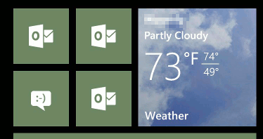
They are like that to give consistency to Microsoft's offerings. Also, too many random photos and colors makes your start screen look messy. Too much plain accent looks boring. You need a good mix.
 
I have no problem with the tiles..... (customizable would be an added advantage)

by the by, i would wish that the toast notifications are semi transparent (for instance, when it came when playing games like AE 3D Moto, the important part of the screen is blocked for quite sometime and so for other apps which makes use of full screen)... just saying

You can get rid of the toast notifications quickly by swiping right on them.
 
You can get rid of the toast notifications quickly by swiping right on them.

true... but why extra swiping, when you dont have to. just saying coz... it kinda disturbs me especially when i play games or even while watching video (if it were to be transparent like video menu you acknowledge it but did not disturb u)
 
true... but why extra swiping, when you dont have to. just saying coz... it kinda disturbs me especially when i play games or even while watching video (if it were to be transparent like video menu you acknowledge it but did not disturb u)

That comes down to preference. i don't really think it is any worse than the other OSes (I own/owned them all recently).

I don't find swiping to be annoying at all...then again I may not be as popular as you!
 

Members online

No members online now.

Forum statistics

Threads
334,647
Messages
2,257,627
Members
428,728
Latest member
navika erdiana