WPCentral Contest: Submit your Nokia Glance Background!
- Thread starter Rich Edmonds
- Start date
You are using an out of date browser. It may not display this or other websites correctly.
You should upgrade or use an alternative browser.
You should upgrade or use an alternative browser.
- Status
- Not open for further replies.
weddi_eddy
New member
- Feb 28, 2012
- 6
- 0
- 0
link68759
New member
- Oct 26, 2011
- 746
- 0
- 0
uselessrobot
New member
- Nov 14, 2012
- 552
- 0
- 0
santillanavila1993
New member
- Dec 22, 2012
- 35
- 0
- 0
ArchieVellie
New member
- Oct 8, 2011
- 1
- 0
- 0
BucksterMcgee
New member
- May 29, 2011
- 10
- 0
- 0
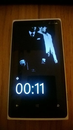
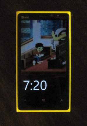
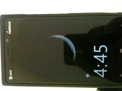
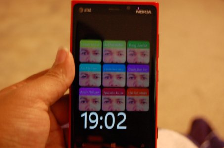
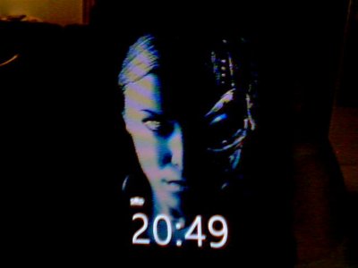
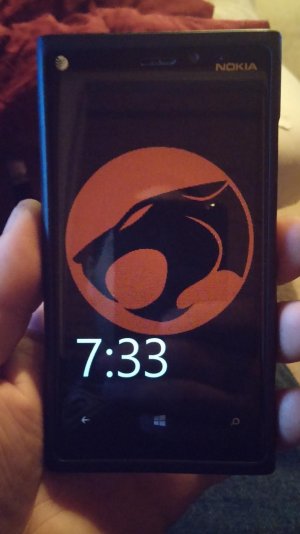
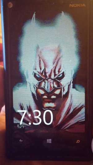
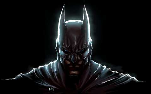
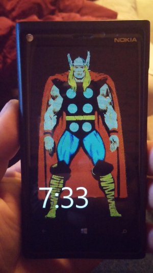
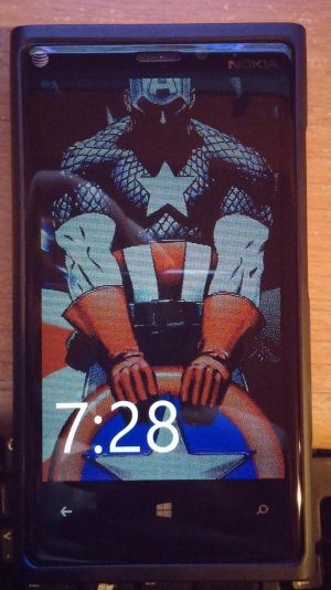
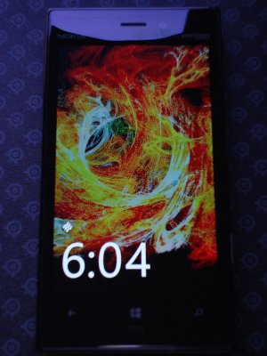
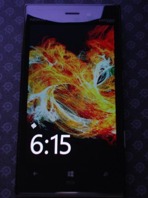
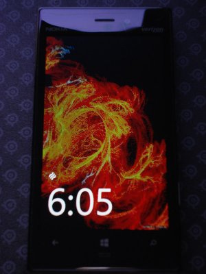
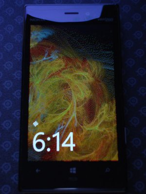
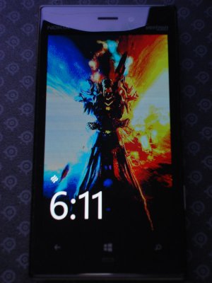
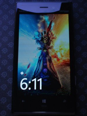
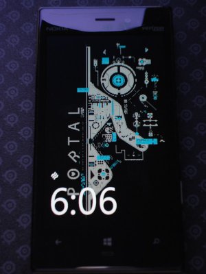
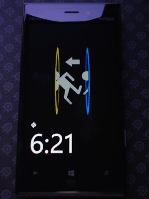
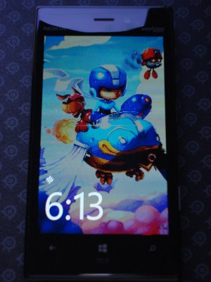
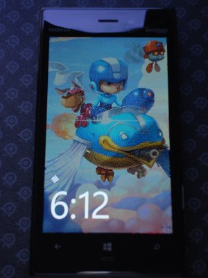
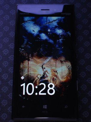
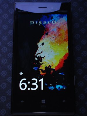
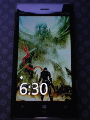
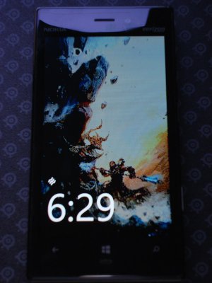
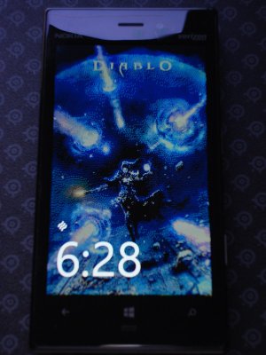
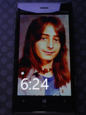
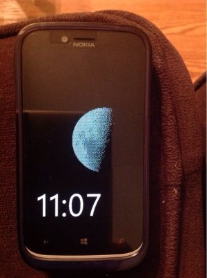
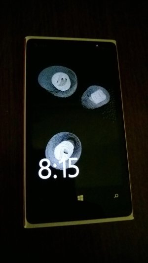
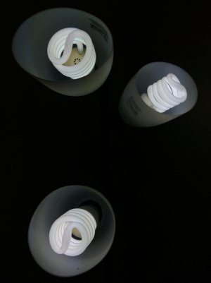
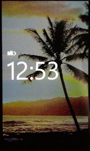
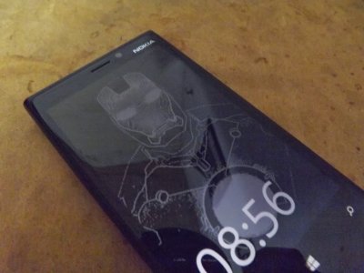
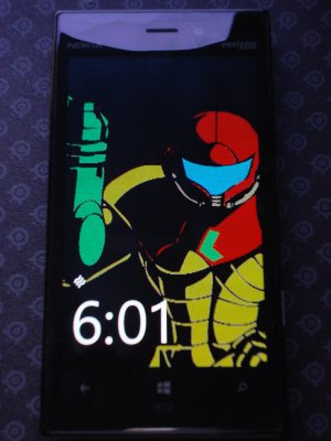
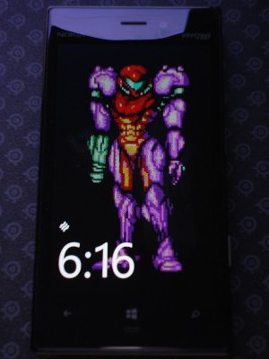
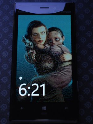
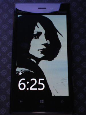
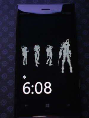
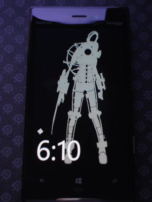
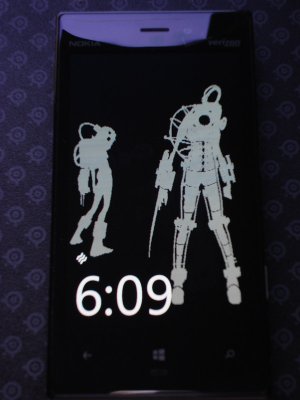
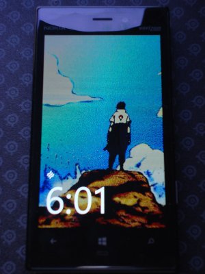
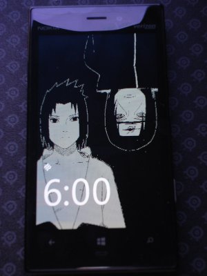
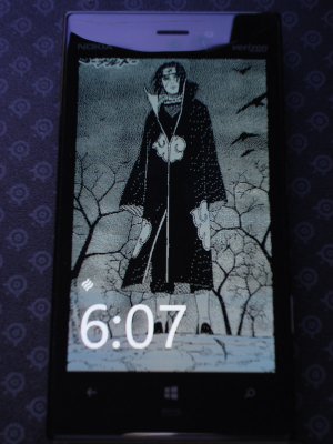
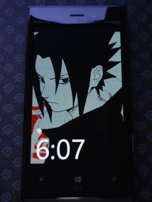
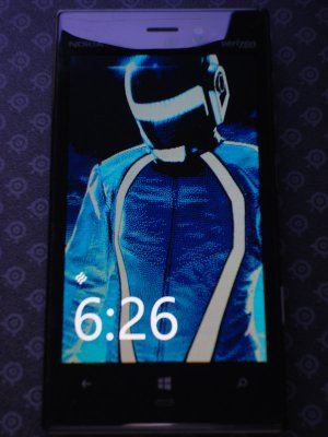
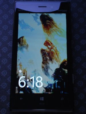
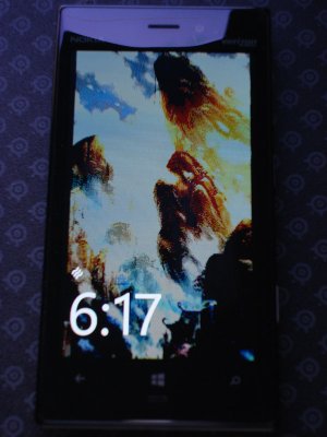
I've been playing around with a lot of different backgrounds to see which look best. So far it's pretty clear that solid vector images work the best, but some other slightly more complex images like ones with a "painted" look and 16bit graphics seem to work fairly well to.
The original images I used can be found here: http://sdrv.ms/19wRLR3 (there are also some other images in there that I don't think work well, but others are free to try)
Most all of them are using full color with the number 2 setting to make them darker/richer. There are a very few that use the number 1 unmodified setting, like the Bioshock Infinite Burial at Sea image, and others that I have examples both settings 1 and 2.
For the most part it's up to personal preference, but setting 2 does help overcome the washed out effect that happens because of low brightness/limited detail used (at least on OLED). Often the number 2 setting might look too dark/saturated inside the app but actually equalizes out well in actual glance mode.
P.S. I do have to say, given how bad I've seen burn in with OLED screens... I'm actually somewhat terrified to leave my glance screen on all the time with these backgrounds. Even with it rotating through 4 images and at a fairly low brightness... as neat as that is.. it's not worth having those images burnt in and ghosting over everything I do a few months from now.
Here are the first 15:



Last edited:
BucksterMcgee
New member
- May 29, 2011
- 10
- 0
- 0
BucksterMcgee
New member
- May 29, 2011
- 10
- 0
- 0
LightningXCE
New member
- Nov 11, 2012
- 9
- 0
- 0
Mitchell Cordova
New member
- Apr 23, 2013
- 3
- 0
- 0
Cole Schneider
New member
- Sep 12, 2013
- 4
- 0
- 0
- Status
- Not open for further replies.
Similar threads
- Replies
- 45
- Views
- 20K
- Replies
- 18
- Views
- 11K
- Replies
- 226
- Views
- 49K
- Replies
- 203
- Views
- 44K
- Replies
- 91
- Views
- 27K
Trending Posts
-
-
Question Windows 11 and Linux on separate drives?
- Started by Verax
- Replies: 0
-
-
Question Win-11 - Problem with moving files from C: to New Partition on E:
- Started by fasteddie01
- Replies: 2
-
Windows 10 Themes no longer working...
- Started by DocCovington
- Replies: 6
Forum statistics

Space.com is part of Future plc, an international media group and leading digital publisher. Visit our corporate site.
© Future Publishing Limited Quay House, The Ambury, Bath BA1 1UA. All rights reserved. England and Wales company registration number 2008885.

