Can anyone tell me what resolution my images need to be for a Lumia 920? I know it's a 768x1280 screen, but the phone stretches images of that size beyond the edges of the screen, in order to make the parallax effect when scrolling. I'm trying to get an accurate position for some elements. Thanks!


![wp_ss_20150413_0003-thumb[1].jpg](https://forums.windowscentral.com/data/attachments/66/66636-3e33be70f9bc0a5d85574d141877ea9a.jpg "wp_ss_20150413_0003-thumb[1].jpg")


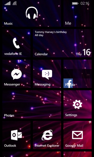
![wp_ss_20150414_0001[1].png](https://forums.windowscentral.com/data/attachments/67/67358-472f46f14b03f47d9008ada503b3c666.jpg "wp_ss_20150414_0001[1].png")


 . Here's my start screen currently.