Cobalt theme after 8.1
- Thread starter carlosrdd
- Start date
You are using an out of date browser. It may not display this or other websites correctly.
You should upgrade or use an alternative browser.
You should upgrade or use an alternative browser.
Rolando Javier Zambrano
New member
- Apr 14, 2014
- 13
- 0
- 0
BioticCharger
New member
- Mar 23, 2014
- 40
- 0
- 0
That was the first thing I noticed after the update! I don't know if it's only the cobalt theme though?
rockstarzzz
New member
- Apr 3, 2012
- 4,887
- 1
- 0
You need to understand the fact that this is developer preview and colours of the screen are related to firmware. Until you see a firmware from your manufacturer, you are not going to be able to see this change.
nightspark
New member
- Jan 22, 2013
- 19
- 0
- 0
Having the same problem too. The hexadecimal for cobalt is 0020C2, the new "cobalt" is too pale. Hope MS fixes it soon.
rockstarzzz
New member
- Apr 3, 2012
- 4,887
- 1
- 0
Having the same problem too. The hexadecimal for cobalt is 0020C2, the new "cobalt" is too pale. Hope MS fixes it soon.
MS can't fix that. It needs a firmware update.
Yes , you're right . It appears the change the color saturation a little bit. It seems less ' Blue ' like you said. But I like it this way , it was way too saturated in 8.0 and since i use the new background screen , the accent color does not matter that much now ")
Kram Sacul
New member
- Mar 4, 2013
- 750
- 0
- 0


matfantastic
New member
- Jan 29, 2013
- 33
- 0
- 0
Same here,really prefer the color as it was before. I only ever use cobalt so this disappoints me. I know its a dev preview but I've run into a lot of bugs so far. Still love it though
Adriaan NL
New member
- Mar 10, 2014
- 138
- 0
- 0
Same here,really prefer the color as it was before. I only ever use cobalt so this disappoints me. I know its a dev preview but I've run into a lot of bugs so far. Still love it though
Same here! I don't like this new one. I switched to Emerald for the time being - fits better with Xbox Music too, though I still prefer the old Cobalt.
nikolas88
New member
- Dec 10, 2013
- 10
- 0
- 0
This was one of the first things I noticed after the update, as Cobalt was my accent color most of the time. I think it's design choice, I saw the same color during BUILD presentation of WP. It's not up to firmware, because OEMs cannot change accent colors, they can only add new ones. And it's not up to screen, because when you compare screenshots, it's obvious that the color itself is changed.
I like new Cobalt though.
I like new Cobalt though.
JudgeHolden
New member
- Apr 26, 2011
- 221
- 0
- 0
It's purple for me.
I've complained about this in the past, as Nokia updates made it purple when the screen wasn't at full brightness, but this makes it purple regardless of any changes I can control.
I've complained about this in the past, as Nokia updates made it purple when the screen wasn't at full brightness, but this makes it purple regardless of any changes I can control.
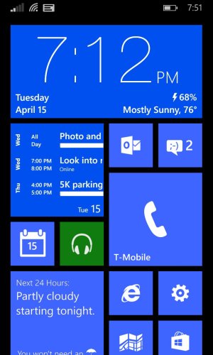
Madness!! Here is a photo showing the difference, its pretty noticeable. I agree it that it leans more on the purple side now. I also attached a blue that is the closest I can get to the original cobalt once applied as a background photo. You cant just color pick the blue from a "phone" screenshot because it seems like wp8.1 adds a very thin transparent black overlay over the background photo for the tiles so if you color pick it ends up being slightly off once applied as a background. Hope that makes sense, hopes this helps for now. Hopefully the color will be "fixed" with the firmware updates from carriers, but I am not counting on that.
Attachments

Kram Sacul
New member
- Mar 4, 2013
- 750
- 0
- 0

Since cobalt is the only accent color in 8.1 that is different from 8.0 I'm afraid to say this was a design choice rather than any kind of color accuracy issue. A very poor design choice as cobalt was probably my favorite accent color.

As you can see the new cobalt is lighter, less saturated and looks more like a light purple on certain screens than blue. This is even more evident when you compare them in text messaging, the people tile, and the task switcher which uses darker and lighter shades of the accent colors. It's just not the same obviously.
This is not the first time MS has modified an accent color in WP but it certainly is the most dramatic and IMO disappointing. I would have much rather them add more colors (Nokia Blue anyone?) than replace a popular one.
Note: The darker shade of the original cobalt is very close to Nokia Blue oddly enough.
Similar threads
- Replies
- 2
- Views
- 41K
- Replies
- 0
- Views
- 33K
- Replies
- 2
- Views
- 4K
- Replies
- 1
- Views
- 9K
Trending Posts
-

-
 This new Windows smartphone does something most Android phones can't
- Started by Village_Idiot
- Replies: 0
-

-
Windows 11 Power Icon Remotely changed! (Percentage Gone)
- Started by Fifth313ment
- Replies: 0
Forum statistics
Space.com is part of Future plc, an international media group and leading digital publisher. Visit our corporate site.
© Future Publishing Limited Quay House, The Ambury, Bath BA1 1UA. All rights reserved. England and Wales company registration number 2008885.
 Twitter