2 Minutes made you change your opinion??

I am talking about the site in general as I don't know any authors of the site by name - so i can't say I talk about a specific person.

And I'll say that even I thought three posts on the same topic was excessive. We had a bit of discussion around that
 
The argument that most people use a phone two handed most of the time is a bad one, because when you need to use the phone one handed, you need to. Trivial in the grand scheme of things, but it is those little things that make an operating system enjoyable. That's where Apple wins out time and time again: the look and feel is always high-end and you can sense that the user experience is always in their minds. On the other hand, I often get the feeling with MS stuff that there is a vast bureaucracy ruling behind the scenes that is endlessly constrained by the needs of other parts of the company. The menu system for phones seems to be getting changed so that it can both make it more like Android to make app developers happy, while at the same time working on tablets, laptops, and PCs. Compromises, compromises. Personally, I think trying to cram everything onto phones is making them less useful, and I'm not that enthusiastic about the idea of universal apps. I'm simply not going to be using Excel or Word on my phone for anything but possibly reading a document or maybe editing a word or two. It is productivity destroying to waste time trying to do work using a tool that isn't appropriate for a job.
 
The argument that most people use a phone two handed most of the time is a bad one, because when you need to use the phone one handed, you need to. Trivial in the grand scheme of things, but it is those little things that make an operating system enjoyable. That's where Apple wins out time and time again: the look and feel is always high-end and you can sense that the user experience is always in their minds. On the other hand, I often get the feeling with MS stuff that there is a vast bureaucracy ruling behind the scenes that is endlessly constrained by the needs of other parts of the company. The menu system for phones seems to be getting changed so that it can both make it more like Android to make app developers happy, while at the same time working on tablets, laptops, and PCs. Compromises, compromises. Personally, I think trying to cram everything onto phones is making them less useful, and I'm not that enthusiastic about the idea of universal apps. I'm simply not going to be using Excel or Word on my phone for anything but possibly reading a document or maybe editing a word or two. It is productivity destroying to waste time trying to do work using a tool that isn't appropriate for a job.

This is off topic but I've stated this before on this site, Office on WP isn't meant for writing a dissertation. It's for quick edits when it's inconvenient to use your Laptop or Tablet or you simply don't have those devices with you.
 
Microsoft is certainly giving the power to allow developers to write once, run anywhere, in the spirit of Windows-as-a-Service. I don't think they're forcing all apps to be universal, though; that is an option given to developers to figure out if it makes sense. However if developers do choose to do it, there are options to make sure any rewrite from platform to platform is very little, if any. I think people say they're not interested in Universal Apps, but they also don't understand the developer and designer pain that arises from porting the same code across platforms, programming languages, and paradigms. It's expensive (in all connotations) to maintain various apps across various platforms, so I'm all for what's coming in power and flexibility.

Less work for our talented developers means more focus on high quality apps for the user in the future.
 
The argument that most people use a phone two handed most of the time is a bad one, because when you need to use the phone one handed, you need to. Trivial in the grand scheme of things, but it is those little things that make an operating system enjoyable. That's where Apple wins out time and time again: the look and feel is always high-end and you can sense that the user experience is always in their minds. On the other hand, I often get the feeling with MS stuff that there is a vast bureaucracy ruling behind the scenes that is endlessly constrained by the needs of other parts of the company. The menu system for phones seems to be getting changed so that it can both make it more like Android to make app developers happy, while at the same time working on tablets, laptops, and PCs. Compromises, compromises. Personally, I think trying to cram everything onto phones is making them less useful, and I'm not that enthusiastic about the idea of universal apps. I'm simply not going to be using Excel or Word on my phone for anything but possibly reading a document or maybe editing a word or two. It is productivity destroying to waste time trying to do work using a tool that isn't appropriate for a job.

Lol. I think you haven't yet tried to use the iPhone 6 plus with single hand.
Universal apps, gives developers a great opportunity to develop once and deploy to various form factors. As a developer, I feel its very useful for us. My corporate clients are very happy about it.
 
Last edited by a moderator:
Lol. Being a ******, I think you haven't yet tried to use the iPhone 6 plus with single hand.

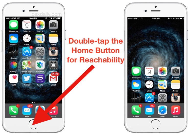
use-reachability-iphone.jpg
 
I am firmly in the camp of the preservation of the Metro UI. The article from the ex-Microsoft employee does provide some additional insight into Microsoft's thinking - a breath of fresh air in fact. But all it says to me is that they (MS) had a problem with Metro and instead of trying to solve it, the hamburger simply became a workaround too tempting to overlook.

The hamburger doesn't attempt to hide the fact that it has nothing to do with Metro or its evolution and that problem has yet to be solved in Windows Phone and we can shape that. What we have now is less discoverability between the ellipsis vs hamburger vs swipe left/right (pivot) and top vs bottom controls. A user has multiple ways to expose different menus and settings etc with very little consistency of approach or design ethos between various apps and built-in system controls. A far cry from simplicity and elegance of Windows Phone 7.0.

The good news in all of this is that there is every chance to change Microsoft's direction since they are currently in a modern era of actively and publically seeking feedback from Windows 10 right down to the Remote Desktop Connection app for Windows Phone. We've seen that they are listening and have made changes to apps like OneDrive following quality feedback.
 
The argument that most people use a phone two handed most of the time is a bad one, because when you need to use the phone one handed, you need to. Trivial in the grand scheme of things, but it is those little things that make an operating system enjoyable. That's where Apple wins out time and time again: the look and feel is always high-end and you can sense that the user experience is always in their minds.
I disagree, as someone that has to use iOS and OSX for work, I often find that some software is so restrictive that it actually becomes unfriendly to the user. True, some things are user friendly but a blanket statement that iOS is completely user friendly is wrong. IMO, navigating around the OS is a chore. Having only one physical button means that I'm often forced to use two hands when clearly a back button would be more useful. Or times when an action center would be more fitting but all those actions are tucked away in another menu at the top. None of that is user friendly.
 
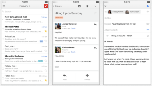
Now I understand what everyone is talking about the hamburger menu. I searched for "implementation of hamburger menu" and got some pictures. Ya I can see the actual implementation on iphone and yes it looks ugly.
screen-shot-2014-10-06-at-2-14-31-pm.png

Might be the guys with iPhone can advise everyone how they reach out to the hamburger menu with one hand and then we can ask Microsoft to implement the same methodology.
 
Oh, you said "One Persons opinion", in any case, I'd say We've established that the UI coverage this weekend was a tad excessive

Maybe it's not one person's opinion but he's definitely making sure that the pieces he publish on his site align with his one opinion. There are things about WP10 that he personally doesn't like and he's going to keep pushing content to fit that agenda. Reason or logic be damned.
 
Maybe it's not one person's opinion but he's definitely making sure that the pieces he publish on his site align with his one opinion. There are things about WP10 that he personally doesn't like and he's going to keep pushing content to fit that agenda. Reason or logic be damned.
Speaking for WMPU again, everyone of the main staff is against the new UI. Anyone is welcome to post in support of it as a guest post (though Id be lying if I didn't find the deluge on the weekend slightly tedious)
 

A video would better illustrate the point.

https://www.youtube.com/watch?v=7l_MpTMkK00

I also think the video points out something very important. A lot of focus is on reachability. There's almost zero focus on usability. Take for example, Safari. Even with the "double tap to reach" feature, that's still three taps to select a function.

I can do the same with one tap of the back button or two taps total using the action center. It takes iOS double the amount of effort. That's not effective usability. (and heavens forbid you mess up and go back to the home screen)

What makes the OneDrive redesign so useful is the implementation of all three usability options, hamburger, pivot, action center. But that can't be applied to every app. The calculator app for example. As previously pointed out, the hamburger menu is a great implementation. You'd be swiping forever if all those features were on a pivot, and trying to stuff all those options into the action center would clog your screen.

So let's not discount usability in this discussion. It's very important.
 
Speaking for WMPU again, everyone of the main staff is against the new UI. Anyone is welcome to post in support of it as a guest post (though Id be lying if I didn't find the deluge on the weekend slightly tedious)


Personally I found the posts refreshingly different from all the gung-ho pro Microsoft stuff posted here and elsewhere that tries to bury any dissenting opinion.
 
Personally I found the posts refreshingly different from all the gung-ho pro Microsoft stuff posted here and elsewhere that tries to bury any dissenting opinion.

I like WMPU because they copy articles from many other sites, so I don't have to read all of them. Although, If they want to give an opinion they should invite someone more qualified. Some of the post in this forum are better than their articles.

In other words, they're good at copying things, they aren't good at thinking.