(Official) New Windows Central Design Thread - Bug Fixes / Issues / Problems

randomscandinavian

New member
Dec 1, 2012
186
0
0
Visit site
Like I said, it's been like that for about a week. I don't remember exactly. Tried the Chrome browser in which the pages look the same. Deleted all cookies and history and whatnot in Chrome but with no help.

The rest of the internet looks fine.
 

Laura Knotek

Retired Moderator
Mar 31, 2012
29,437
55
48
Visit site
Like I said, it's been like that for about a week. I don't remember exactly. Tried the Chrome browser in which the pages look the same. Deleted all cookies and history and whatnot in Chrome but with no help.

The rest of the internet looks fine.


It's not the browser. I use Firefox, and it's the same.
 

eddlang

New member
Aug 8, 2013
43
0
0
Visit site
The new design is good; I liked the old one too, but this is nice also. No issues that I can see on IE11.

It's not all good though. While the old design worked fine on Opera Mini for Symbian (on a "Nokia C7 with Symbian Belle Refresh" update, to be exact), this new one has issues.

Opera Mini 7.1.32448 (the latest available version on symbian)

WPC-OpMn-symbn.png

The left hand side bar shows up on itself during loading and cannot be closed. The page is basically unreadable.

P.S. a question for those who have iphones and/or android phones and use opera mini; does it look like this for you too?
 
Last edited:

James Falconer

New member
Nov 1, 2012
1,891
0
0
Visit site
Like I said, it's been like that for about a week. I don't remember exactly. Tried the Chrome browser in which the pages look the same. Deleted all cookies and history and whatnot in Chrome but with no help.

The rest of the internet looks fine.

Flagging this one to our tech team to take a look. Hopefully they can recreate the issue. I can't :(

​We'll get to the bottom of it!
 

Chris_Kez

Member
Nov 29, 2012
900
0
16
Visit site
I'm guessing you guys are most interested in constructive feedback for debugging purposes and whatnot. I'll try to do that in the coming weeks, but I have to say my first impression is not a positive one. The strong blue tint obscuring all the photos along the top is just unattractive and actually makes the photos less valuable as visual cues. The red WPC logo seems to clash and is maybe an odd tint. I don't know, I'm not a designer or anything- I can only say I had a strong negative reaction to the colors and visuals. I won't comment much on the layout or functions until I get used to them; it's too easy to reject a new layout just because it's different.
 

RWD

New member
May 27, 2014
67
0
0
Visit site
Don't particularly like it. It's form over function. It's harder to navigate to other Mobile Nations sites and you've removed the option to view the full site, meaning I have to switch it in my 1520's browser settings, then switch back on other sites that have a decent mobile page.
 

davidD93

New member
May 28, 2013
104
0
0
Visit site
Well I'm glad the arrow has been added to navigate to the other MN sites easily. The WPC words still disappear when hovered over, however, and I don't think the header appearing when one scrolls up - it should either be there constantly when scrolling, or not at all (ie only when at top of page).
 

randomscandinavian

New member
Dec 1, 2012
186
0
0
Visit site
Oh, and I should mention that clicking on any news story headline doesn't actually get me to that story. The url in the browser shows that it does but the page content is just the page of news headlines that I came from (/articles). So essentially the functionality is broken and not just the looks.

So since nothing is happening I guess I will find another site for my phone news. Too bad because things were pretty much perfect before these "improvements". I need my iPad to read news in the morning. My phone is too small for my eyes to read comfortably.
 

RWD

New member
May 27, 2014
67
0
0
Visit site
Personally I dislike it. I really don't care about the colours, if they are your brand that's fine. What I do care about:

1: it's slow to load. I'm viewing on an Atom based Lenovo Tablet 2 in the metro IE and each page takes 10 seconds to load. Other sites are snappy. I noticed this with Crackberry a while ago - seems you guys like to fully load up the sponsors ads before you let people interact with the page.
2: it's hard to find anything. Maybe that will change with familiarity but for now the layout sucks for me.
3: trying to use it on the phone (Nokia 1520) is a pain. The previous version allowed me to load the full site, which with the 1520's screen was quite easy to read. This one does not seem to allow that, so I have to bear with the mobile site. When scrolling down, the bar at the top disappears, which is good, but if I scroll up a millimetre it pops back up, forcing the entire page down by its humongous width. Very distracting. Also impossible to get a decent view of a forum page as it's truncated into short little sections, making you hit the page buttons way too much.

I don't see why I should have to download your app to read the site. If you'd design the site properly in the first place I wouldn't. Think I'll opt out for a while and hope it gets fixed before I come back.

By the way, the quick reply box should be twice as deep.
 

Guzzler3

New member
May 4, 2012
1,398
0
0
Visit site
Found a way to speed up the forums, slightly.

Make sure you are logged in.
Scroll down to the very bottom
Select the [-] across from "What's Going On?"

This will hide the list of "Currently Active Users".
 

Guzzler3

New member
May 4, 2012
1,398
0
0
Visit site
Now I'm noticing that the side scrolling banner of stories at the top is taking longer to load, slowing down refreshes.

Any way to get around this and speed things up? I've already tried clearing my cache, and also uninstalling, re-installing IE.
Windows 8.1 Pro, IE 11.0.9600.17207
 

b_wilson

New member
Jan 25, 2013
9
0
0
Visit site
After a week or so, I still find reading the top stories very uncomfortable. The purple/blueish picture with thin white text, crowded together a little...a VERY bad combination. I'm much more comfortable reading the non-top headlines below against the plain white. And, except that I know WPCentral has the latest WP news, I prefer getting my news from other sources with easier to digest design.
 

trev81uk

New member
May 28, 2014
68
0
0
Visit site
I really dislike the new website design, for me the biggest issue with it, is that it doesn't run well on a Windows Phone! Kinda defeats the purpose doesn't it!
 

Laura Knotek

Retired Moderator
Mar 31, 2012
29,437
55
48
Visit site
Would it be possible to add the "x" to close the sidebar closer to the top of the page? One needs to scroll over halfway down the page to get to it. The other sites (AC, CB, CN, IM) do not require so much scrolling to close the sidebar.
 

Guzzler3

New member
May 4, 2012
1,398
0
0
Visit site
Now I'm noticing that the side scrolling banner of stories at the top is taking longer to load, slowing down refreshes.

Any way to get around this and speed things up? I've already tried clearing my cache, and also uninstalling, re-installing IE.
Windows 8.1 Pro, IE 11.0.9600.17207
OK, figured out it was bitrot with my system. Doing a W8 refresh (keep docs, pics, etc.) and then doing all the required updates, the site loads fine now.

So, if you are having issues you might want to try a system refresh and see if that clears it up.
 

Chris_Kez

Member
Nov 29, 2012
900
0
16
Visit site
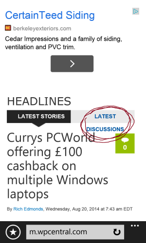
Maybe I just never used the mobile site before, but I've hit it a few times in the last few weeks and have found it a bit challenging.
In first pic, you can see that text reflow doesn't work properly.
wp_ss_20140820_0001.png
Okay, so I click on the story there about Curry's and it goes to this view, which has no immediate sign of the story. You see another big blue-tinted story and a giant Sprint ad- but worst of all is the huge area I've boxed in red where you cannot scroll to find your story.
wp_ss_20140820_0003.png

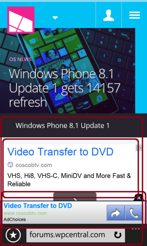
So then I tried using the drop-down menu at top to jump into the Forums?Same thing. You tap "Forums" and you're taken to this view- again, a new blue-tinted story and a huge area where you can't scroll. And now you have not only the huge Video Transfer ad, but now you have a second, smaller pop-up banner between ad #1 and the address bar. Not only is it a pain in the **** from a usability standpoint, but there are like TEN different fonts in action here, plus the two completely different style of ads that have different little icons for closing or engaging with them.
wp_ss_20140820_0004.png

I'll stick with the app for the time being.
 

Members online

Forum statistics

Threads
327,243
Messages
2,249,640
Members
428,619
Latest member
sprunki-phase