This might be the Windows Phone 10 Start Screen

anon(8141431)

New member
Oct 15, 2013
277
0
0
Visit site
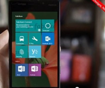
I saw this while I was watching the replay of the TechEd 2014 europe windows 10 demo.
They say it's not the final UI. But this already looks promising. win10two.JPG
https://www.youtube.com/watch?v=dVfGOh7ZoOo
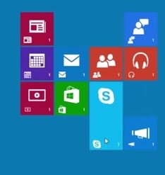
Also,in the above video of the win 10 9879, We can see a new tile size (vertically wide) around the 1:23 mark. Since Windows 10 will share elements with windows phone 10, this might also be coming to windows Phone 10.
win 10 3.JPG


So... What do you guys think?
 
Last edited:

Ebuka Allison

New member
Feb 19, 2013
1,391
0
0
Visit site
I saw this while I was watching the replay of the TechEd 2014 europe windows 10 demo.
They say it's not the final UI. But this already looks promising. View attachment 89573

https://www.youtube.com/watch?v=dVfGOh7ZoOo
Also,in the above video of the win 10 9879, We can see a new tile size (vertically wide) around the 1:23 mark. Since Windows 10 will share elements with windows phone 10, this might also be coming to windows Phone 10.
View attachment 89574


So... What do you guys think?
According to Brad Sams, TomWarren and DR (or one of the three) Its an app
 

Enuniq

New member
Apr 17, 2014
11
0
0
Visit site
Wow, that looks good... I've always loved the Windows 8 look for a phone. Also, the option of transparency would make it even better. (if user wanted it)
 

a5cent

New member
Nov 3, 2011
6,622
0
0
Visit site
Fill up the remaining empty areas with tiles and it will look pretty much like WP8.0 did, with an additional mystery background you'll never see, except for the left and right sides... kind of like bringing back a smaller gutter from WP7 and adding one more. In that specific picture the setup looks okay, but for anyone that prefers live tiles over a lot of useless and empty space, it's pretty much pointless.

What I wouldn't mind is the ability to group tiles and label them with a header, as shown. I would have preferred that over the folders. I think those groups are the only part of that screenshot that makes any sense.
 

jojoe42

New member
Sep 13, 2013
1,078
0
0
Visit site
I will probably miss the transparent tiles :( but I guess if that's part of the unification of the UX then I guess that's fine really
 

Slovenix

New member
Feb 24, 2014
878
0
0
Visit site
The best would be normal/+ now transparent tiles with a true wallpaper.. Simple as that, I really don't know what's so hard for them to make it that way since Windows 8.1 is like that.. And with a zoom in to app style instead of flipping, not that I don't like it, it's pretty original, but it creates virtual slowness which affects user experience. Zooming in looks faster and relaxing to the eyes.

+ wallpaper affecting the whole OS from start screen to app list to action centre..

+ I'd prefer something to be on the left side of the Start screen so the wallpaper would scale in landscape mode.
 

Stefan Holder

New member
Apr 30, 2013
427
0
0
Visit site
I'm not sold on this, if it were to swing that way. The present WP8.1 screen should be kept. I don't like the floating tiles look with all that wasted space around. Plus as another user commented, they better keep transparency around. Else the background wallpaper will remain a mystery.
Sent from my Samsung ATIV S using Tapatalk.
 

nohra

New member
Jun 10, 2013
246
0
0
Visit site
This seems like it would be a step back from the current interface: 1) a lot of wasted space around the border 2) looks like a Windows 8 setup rather than a new interface. That being said, I would not mind built-in grouping with titles for the start screen. But I just think phone screens are too small to really do a background AND tiles. I think the other platforms can pull it off because they just have small icons with plenty of space around the icons to show the background.

I think it will either be very similar to what we have now or be like the W10 start menu tiles... or be something completely different, but I doubt that since they want to 'unify' the devices.
 

DMCarver

New member
Jun 11, 2014
52
0
0
Visit site
Look at the image in detail of the phone..... It looks like a background image/wallpaper, then the tiles have their own transparent background image. See how the top two tiles plus the few below it have the same green background and you notice the word on the tile goes across the top two tiles? I think this is a transparent tile background separate from the wallpaper you see behind the tiles. Or I could be crazy....
 

Jason Hendry

New member
Nov 13, 2014
24
0
0
Visit site
Windows phone 8.1 is great plse just improve it and dont go changeing it drasticly. Having the wallpaper like it is now is great, no need to change that. Especially to the very boring old school style.what other people are beginning to like a lot. desktop needs to be desktop not metro end of story, tablets and phones are all fine and growing with improvements. windows 8.1 is now good enough to take on apple and android, just keep progressing with 8.1 and you'll win those customers over. If you change it to much you'll be starting from scratch again. If you wana improve the os then on phone give us build in folders for programs and categorize phone settings better, and add a live tilled album thumbnail view showing 15 album thumbnails on a 5in screen in Xbox music, then you'll be even closer lol.
 
Last edited:

Members online

Forum statistics

Threads
326,088
Messages
2,247,791
Members
428,440
Latest member
jmssse