Your feedback (and bug reports) on Windows Central's new homepage

Doesn't seem to be working as intended. I want to view recent articles and just scroll down endlessly until I notice the article that seem familiar -- meaning I've already read it.

Now I have click on the Recent Hub and then scroll. So a new design added an extra click. I figured that if I click on "Make this my homepage" it'll default to the "Recent Hub" next time I visit the site. That doesn't work either.
 
Another IE 11 thing: as it's been for quite some time, the "show more" (down arrow) control at the bottom of the /blog page renders like it's clickable, but it doesn't do anything when clicked. Stories expire for me at work. :cry::wink:
 
Another IE 11 thing: as it's been for quite some time, the "show more" (down arrow) control at the bottom of the /blog page renders like it's clickable, but it doesn't do anything when clicked. Stories expire for me at work. :cry::wink:

Just to make sure we bug test right; are you using an AdBlocker at all?
 
Just to make sure we bug test right; are you using an AdBlocker at all?

Ahh, good question.
I'm on the enterprise system at work and sure enough, mostly the site is ad-free.
The stories and forum message pages do show the Taboola links at the bottom.

Sorry I don't know what they're doing specifically. I can say that the ad situation is the same in Opera 45.0, but all the controls seem to work there. So... I could maybe just use Opera. ;)
 
To be honest, I'm not a fan of the new look. I much prefer to view all your content sequentially, newest at the top. Navigating your new page is not user friendly, IMHO.
 
Upon another refresh....it certainly does. I'm happy now. I know you all were very focused on whether or not I was happy. ;-)
 
I absolutely dislike this new design.

This new homepage is overwhelming and cluttered. I'm not a person that get's overloaded with information easily, but... I'm finding it a task to navigate around.

Also for the past week or so, the page has taken a lot longer to load. It's now taking >4 seconds to load the homepage. And i'm running on a 6-core Xenon processor with >50GB of ram, so....
 
I didn't like the new iMore site. I thought I would get used to it, but I still haven't. It's way too hard to find what is new so I eventually stopped visiting the page. Now that Windows Central has adopted the same format I will likely stop visiting this page as well. I much prefer the chronological format of the old site. You can pop in. Start scrolling from the top and read all the new stuff. Now you have to pick through pages of stale information to try to find anything new.
 
50% less content and 70% more adds, JUST WANT I ALWAYS WANTED!!!

Yeah your new homepage is now more add than actual content.

PATHETIC

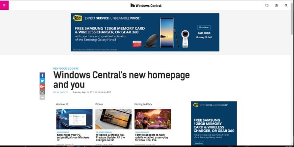
See my attached image which is an actual snippet of the webpage.
Less than 40% of what I see is content the rest is comprised of adds and whitespace.

I know first hand, as a web developer, this is a terrible design.

Capture.JPG
 
Pull your Windows app. It is a total POS. It's obvious no one give a crap about it.
 
What a mess. Can I just have a straight list of news please?

Edit: found it! And changed my bookmark to windowscentral.com/blog :)

Thank you, I have multiple interests Xbox, Phone, Windows, Surface etc. I was losing the will to live with the new page so now using the /blog.
 
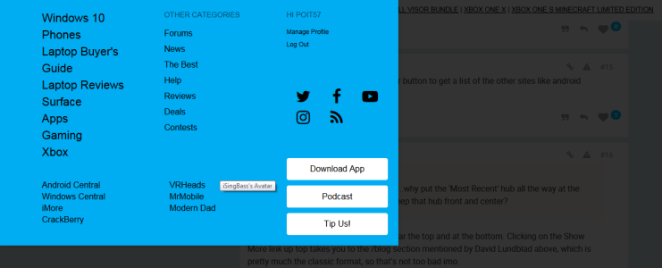
Same experience for me in IE 11. The display shows the menu, but it behaves as though it's not there. It responds as though you're hovering/clicking on the content behind it (the main page).

I've been having the same issues with Internet Explorer 11 on Windows 7 for several months (long before this layout change). The attached picture shows this webpage with the "hamburger menu" opened. I can't click on any of the links, but where I placed my mouse will allow me to click on iSingBass's avatar behind this menu.

By the way, this menu works fine in Chrome, Firefox, and Edge on Windows 10, but I don't have the rights to install third-party browsers on this Windows 7 machine.wincentral.png
 
Seriously? Only 3 articles on the first sight of the page? I know that too much information is not good, but nearly no information is ... worse.
 
Not impressed with it so far. Scrolling/reading is clunky. Big ads are annoying. There's lots of wasted white space as well. It would appear, based on the "welcome" pic, the new look is 'designed' by a bunch of dudes. She's cute, tho'.

If this layout stays I'll be visiting WC less frequently.
 
As a notebook user I'm finding the new layout much more pleasing.
Less scrolling and searching for information is a win for me.
 
I personally find the new design horrible. It's not easy to quickly scan what articles are new. Takes too much scrolling. Luckily there's windowscentral.com/blog to set my new bookmark to
 
Looks and feels very chaotic. Like others have said, it takes longer to peruse articles titles. I guess it will raise the amount of time on the site for those who have the time to troll through the articles.

It's easier to browse using the Windows Mobile app but the app's community functions have been broken for months so any interactions have to be made using other platforms.

So tired...
 

Members online

Forum statistics

Threads
331,822
Messages
2,254,795
Members
428,693
Latest member
Akki