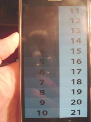
Lumia 950 huge screen calibration problem. Please test and post results.

cristixxxlog

New member
Nov 3, 2015
123
0
0
Visit site
Did the test you sugested.

Stil, the shades from 10 to 4/3 are still WAY too bright.

If we need much more brightness you cannot light up all shades higher and let 0,1 and 2 to full black.


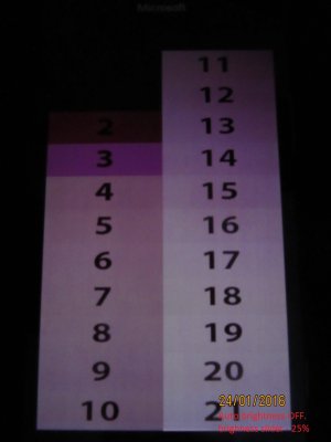
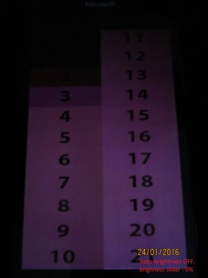
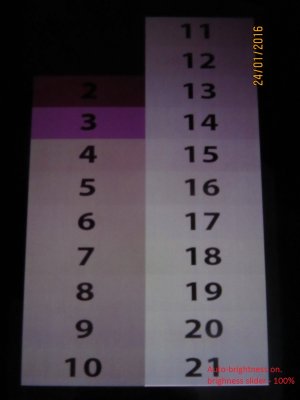
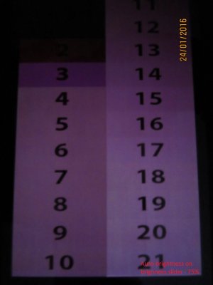
No matter how low or high brightness the screen puts up, we still have around block 4 or 3 a sudden drop of light. We still go from very bright to very dark too sudden. More or less brightness means shifting the sudden drop to black one box higher or lower.


Again, the problem here is dropping to a very dark shade in one step instead of several.


I've put the sensor on top of the screen right above a light bulb, with the rest of the screen outside, so I can see it at max brightness. Yes, the gradient is nicer and clearer, but it still drops around box 2/3 from too bright to too dark. It is still a giant step instead of a gradual one. That means we will still have banding and clipping.

However, this test is just a "never happening scenario" because when we will have so much light, our eyes will be adjusted to that lightning and we will not see the gradient being wrong.


That is why I said dark room, because the darker the environment, the more messed up are the gradients, no matter how low/high brightness we have on the screen.


This makes videos ugly watching them anywhere other than bright environments (in the subway, at night in bed with a normal/dim/no light.
 

hprvez

New member
Aug 7, 2013
327
0
0
Visit site
I have an xl and it does the same thing. Amoleds are really a fail and these panels in articular are among the worst

Oh, I won't even start talking about the grey things scrolling over black background leaving purple ghosting behind, would have expected this kind of nasty **** from a cheap android phone where slow displays actually give the impression of a smooth os
 

cristixxxlog

New member
Nov 3, 2015
123
0
0
Visit site
@hprvez - purple ghosting means exactly what we are talking about here: bad gradients!

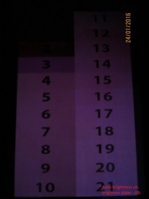
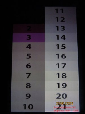
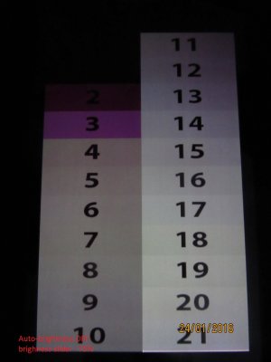
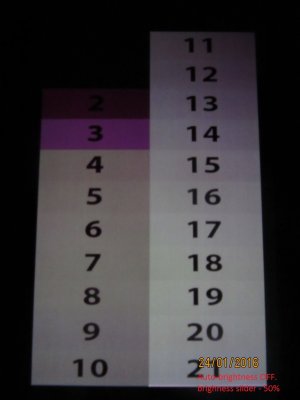
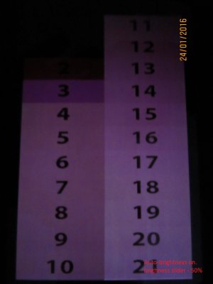
Some samples in each step of brightness, with auto-brightness on and off.
The pictures have written in red what settings each had.
 

Attachments

  • IMG_5312.JPG
    IMG_5312.JPG
    162.2 KB · Views: 1
  • IMG_5311.JPG
    IMG_5311.JPG
    197.4 KB · Views: 1
  • IMG_5310.JPG
    IMG_5310.JPG
    190.2 KB · Views: 1
  • IMG_5309.JPG
    IMG_5309.JPG
    183.6 KB · Views: 1
  • IMG_5308.JPG
    IMG_5308.JPG
    183.2 KB · Views: 1
  • IMG_5307.JPG
    IMG_5307.JPG
    158.6 KB · Views: 1
  • IMG_5316.JPG
    IMG_5316.JPG
    194.7 KB · Views: 1
  • IMG_5315.JPG
    IMG_5315.JPG
    202.1 KB · Views: 1
  • IMG_5314.JPG
    IMG_5314.JPG
    190.6 KB · Views: 1
  • IMG_5313.JPG
    IMG_5313.JPG
    180.9 KB · Views: 1

flitzpiepe666

New member
Dec 19, 2015
27
0
0
Visit site
ok, strange.. that Looks totally different at my phone, will look for my old Nexus to get a Picture of my 950 Screen..
I have great looking steps from 0 to 4 and the steps from 4 to 10 are the same :-O
 

cristixxxlog

New member
Nov 3, 2015
123
0
0
Visit site
@flitzpiepe666 - The problem lies in the range of 4 to 10. The difference is HUGE next to the 3 to 0. The huge jump in darkness ruins everything.
The messed up algorithm is from 4 to 10. This range is way too bright next to the others, no matter the conditions....
If you get a hold of your Nexus, make the test also on that one. Would be good to have a comparison with another....

Only in bright environments this entire problem is not noticeable (basically the screen is perfect) due to the fact that the human eye adapts to high brightness and the gradients "look" good. This is exactly like short/long exposure. Our eye kind of has a "short exposure", thus it is unable to notice the major jumps in the gradients.
 

MindtakerWP

New member
Jul 3, 2013
70
0
0
Visit site
I was doing some testing:

Nice

GG6ghgy.jpg


Really nice

Lx4eKfg.jpg


There is difference in the last two bars (check in good monitor with zoom, in real life its easy to seen):

ykfxToY.jpg


Now the funny part, here I can see easily all the bars (also left bars), but in the PIC is so difficult to see.

znGJXoY.jpg


Then I change the shutter speed, cuz I see all the bars..

And they are there!

tczD9K7.jpg
 

cristixxxlog

New member
Nov 3, 2015
123
0
0
Visit site
@MindtakerWP
Interesting... What app/website/images do you use? Can you post them here (images) or name the app/website?

The normal exposed image (with the instructions) has the most black colors too black - the first 3 boxes- (or the next ones are too bright?) There is big shift between them.
In the overexposed image, everything is messed up, too overexposed I guess... But still, 3 boxes very dark, one barely visible and the rest non-existent.... That is still a massive color shift... For example, in that overexposed scenario, the visible boxes should have spanned to like 7-8 boxes before going completely white beacause of the overexposure. Instead, the colors span to 3 boxes and that is it (the 4-th is so bright that doesn't really matter).


@flitzpiepe666 - that is some bright environment there. And it looks ok, there is too much light for the problem to be clearly seen. However box 1 is too dark compared to box 2 (or the other way around, the same thing).
 

RuleOfSines

New member
Dec 2, 2012
274
0
0
Visit site
Did the light test with mine, in a dark room I aimed a headlamp at the light sensor. The screen brightened up and the gradient suddenly looked normal. Once it faded out it turned the first four boxes completely off again.
 

MindtakerWP

New member
Jul 3, 2013
70
0
0
Visit site
@MindtakerWP
Interesting... What app/website/images do you use? Can you post them here (images) or name the app/website?

The normal exposed image (with the instructions) has the most black colors too black - the first 3 boxes- (or the next ones are too bright?) There is big shift between them.
In the overexposed image, everything is messed up, too overexposed I guess... But still, 3 boxes very dark, one barely visible and the rest non-existent.... That is still a massive color shift... For example, in that overexposed scenario, the visible boxes should have spanned to like 7-8 boxes before going completely white beacause of the overexposure. Instead, the colors span to 3 boxes and that is it (the 4-th is so bright that doesn't really matter).

Yes, but there are big difference between picture and real life, in real life I can see all the bars without any problem.

RGB dimming is from "Hardware Test" App.

bnr-sup-monitor-lg.png


calibration-chart.gif


gray1024x768.gif
 

flitzpiepe666

New member
Dec 19, 2015
27
0
0
Visit site
@flitzpiepe666 - that is some bright environment there. And it looks ok, there is too much light for the problem to be clearly seen. However box 1 is too dark compared to box 2 (or the other way around, the same thing).

As Is said I think there is a Point where one step seems too big because the System turns of Pixels.
Your pc Monitors and phones without amoled Displays dont do that - so maybe that is not the right way to compare!?
 

cristixxxlog

New member
Nov 3, 2015
123
0
0
Visit site
Well whatever the system does, it ruins the images and videos. Jumps like that should't occur, or not too drastic anyway.
I've checked 2 amoleds up till now: Samsung S3 and S6. Both render the gradient normal, and there are no problems in videos/images.

There where massive problems like this with the Note 1. I do not remember how was that fixed, but Samsung released a FW update that mingled with the contrast and switched the "Big Jump" from box 2 all the way to 5 or 6 and made it a tad less noticeable. That fixed the majority of videos and images to the point that you could have seen the spots only if carefuly looking.
So still, our screen is not properly calibrated. Be it the auto-brightness, the light sensor or whatever, the screen is bad.

And amoled or not, that is not how it is suppose to look like...
 

MindtakerWP

New member
Jul 3, 2013
70
0
0
Visit site
@MindtakerWP - So what is the difference between image 2 and 3?
2 looks like crap, 3 looks very good... Exposure?

On all other screens the image looks very similar to the 3rd one....


A very long thread on the Note problem mentioned earlier : [POLL] Black clipping / black crush | AT&T Samsung Galaxy Note I717

Yep, the 2nd has much exposure, check 21 and 20 (almost white), then I took other with better exposure (the 3rd).

But this is only with auto-brightness boost (more than 100%). Without it, 1-3 looks off.
 

Members online

Forum statistics

Threads
326,477
Messages
2,248,410
Members
428,495
Latest member
Jon_AK