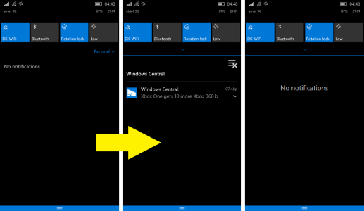
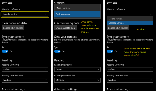
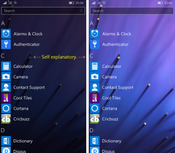
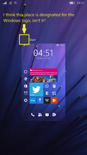
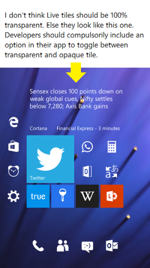
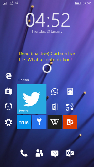
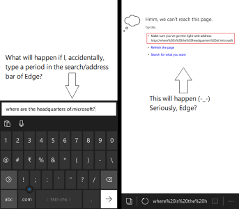
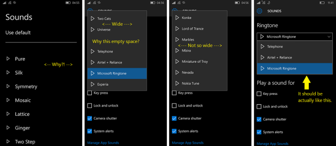
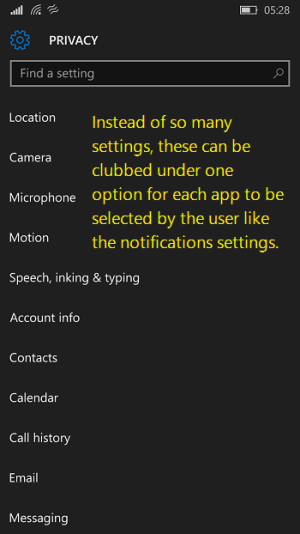
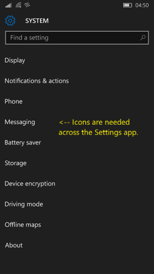
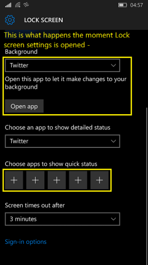
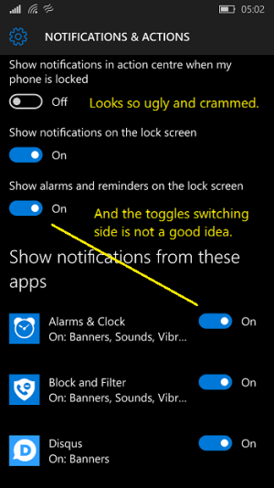
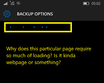
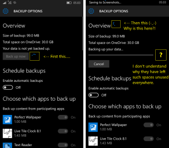
What is the issue with "dead space"? Do we really need to fill everything? :/
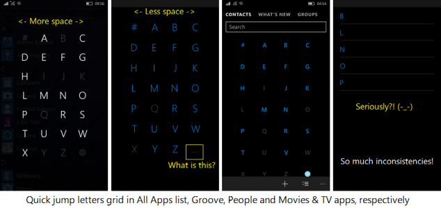
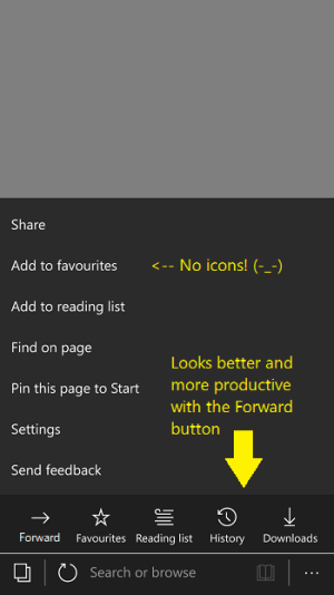
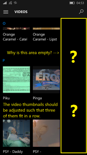
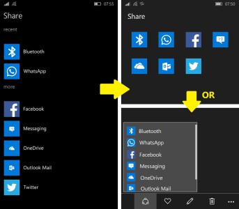
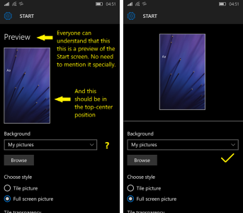
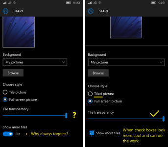
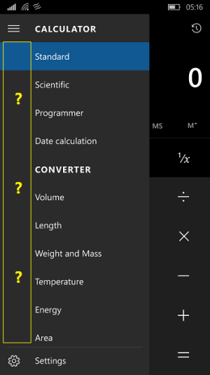
No, we don't. But don't you really see the inconsistencies? Like the Quick jump letters grid. Having spaces is good but they should be consistent across the OS. The Photos app shows 3 picture thumbnails in a row while the Films & TV app only shows 2 leaving so much space in the app. It looks more like disproportionate scaling. In the Calculator app, the Hamburger menu should have had icons instead of blank spaces. Don't you realize how bad those sliders and progress bars look when they aren't stretched across the page? It also looks like disproportionate scaling.
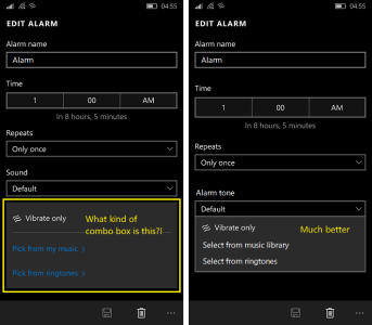
So yes, blank spaces need to be filled, but not everywhere. The Ringtone selection list having a space is ok. Not others. Anyways, it's your opinion. You seem to be a person who likes to live in a messed up room. You like to see the OS as such then be so. I don't find the spaces neat and polished, clearly not!
Very nice write up. I too had become a die hard fan of WP a few years ago. I had come to know about WP when I had first seen a Nokia Lumia 800. Then I used to see the Lumia 520 and 1520 ads on TV as a sub-14 year old teen when I didn't know anything about WP (I wasn't allowed to own a phone until I was 16). Then I started reading about it on the internet, I watched several reviews of the OS and Windows Phones at that time. Then I came across WPC back in 2013. From then onwards I fell in love with WP even when I read and heard a lot that WP was a failure and it has so low market share. My love and loyalty towards WP grew stronger when I bought my Lumia 830. And it was all because of
WP 8.1.
But now I see that whenever I say anything against W10M people tend to think I am criticizing it. I am not. It's my love for WP which makes me say it. I am not a person who would simply turn to Android or iOS or revert back to WP8.1 just because this OS doesn't make me contented. I was told several times not to buy a Windows Phone. My family and friends tried to convince me a lot to buy a competitive Android phone from Samsung or Xiaomi. My uncle even offered to buy me an iPhone 5S. But I rejected it sternly. I simply replied to all these people that "why do you want me to buy something which I hate so badly?". And finally I have my Lumia 830 with me. I am typing this reply on it itself :wink:
So, I want my phone to run an OS which would make me feel contented. In this case W10M. Counter arguments are accepted but not when someone tries to persuade me to accept his views by using harsh language. It won't help. Which is why I have requested people to contribute their ideas. It's not a concept. It's just about all the trivial mistakes clearly visible across the OS. Such trivial things can also discourage the end user from using it.
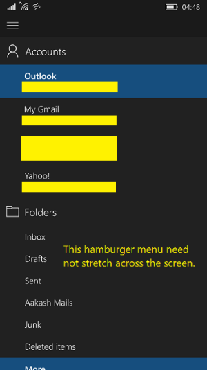
I disagree with the email app, it's how the menu looks like on pc too.
It's not about looks. Yes it's good that the menu is consistent across devices. No arguments on that. But the issue is that the menu is taking up whole of the screen. A full new page would be better instead of the Ham menu. Only this app has such a menu. The point is, the menu is good as it is, but shouldn't take up the whole screen. Ham menus take up a maximum of 2/3rds of the page. Only the Mail app on mobile has something different.
